Speak to Z21
  • Actionable plan on how to grow your online sales
  • Industry-relevant case studies and benchmarks
  • Bounce ideas with our team
  • Enquire about Z21's services

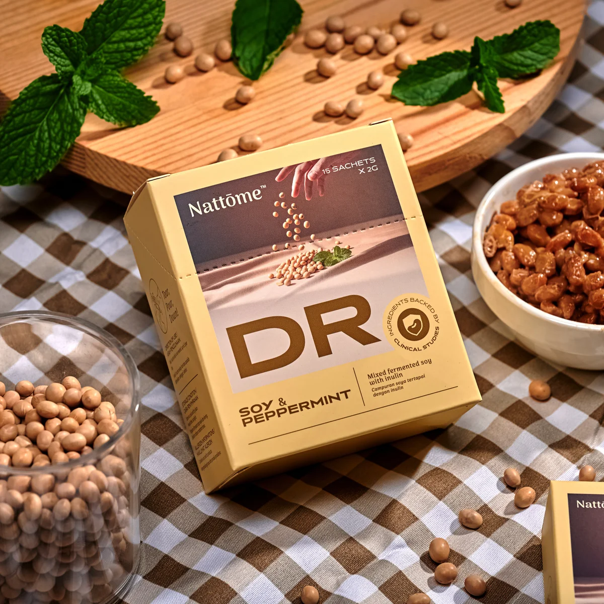
Nattōme

Services

Industry

Health Supplement

Year

2024
First month post-launch
+40%
Conversion Rate
+40%
Conversion Rate
+33%
Add-to-Cart Rate
+16%
Reached Checkout

This is a text when testiominal is not set up.

Lorem ipsum dolor sit amet, consectetur adipiscing elit. Suspendisse varius enim in eros elementum tristique.

Overview

Rebuilt from scratch to achieve +40% Conversion Rate

The revamp introduces Nattome’s new identity through a modern, premium aesthetic. Our primary objective was to transition from passive browsing to a strategic, USP-driven user journey that utilises compelling storytelling to build immediate trust. By streamlining the path to purchase with intuitive navigation, the new design enables informed decision-making and friction-free conversion.

Visual Hierarchy
Trust Signals
Cross-Sell UGC

Before
Before
  1. Unconvincing page with straight up product name & price listing
  2. Cluttered layout of content, making it hard for users to digest info
  3. No clinical story to boost credential
After
  1. Earns trust with stronger content strategy: Video > Ingredient > Proof
  2. Goal-matching recommendations
  3. Clinical data woven in
After
Before
  1. Unconvincing page with straight up product name & price listing
  2. Cluttered layout of content, making it hard for users to digest info
  3. No clinical story to boost credential
After
  1. Earns trust with stronger content strategy: Video > Ingredient > Proof
  2. Goal-matching recommendations
  3. Clinical data woven in
Before
Before
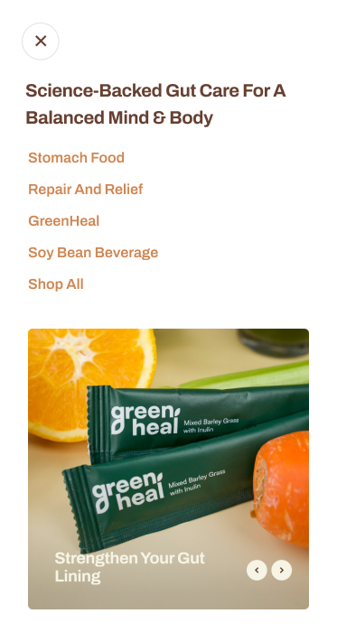
  1. Disjointed browsing journey: can't compare products at a glance
  2. Info-heavy cards
  3. Mobile afterthought
After
  1. User-first decision tool: scan full range at a glance
  2. Linked to clinical studies
  3. Single-column mobile
After
Before
  1. Disjointed browsing journey: can't compare products at a glance
  2. Info-heavy cards
  3. Mobile afterthought
After
  1. User-first decision tool: scan full range at a glance
  2. Linked to clinical studies
  3. Single-column mobile
Before
Before
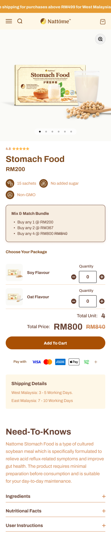
  1. Doubts left open: excessive info = cognitive overload
  2. Unclear bundle choice
  3. No FAQ for hesitations
After
  1. Removes doubt: benefits above fold
  2. Clean bulk ordering
  3. FAQ answers what they Google search
After
Before
  1. Doubts left open: excessive info = cognitive overload
  2. Unclear bundle choice
  3. No FAQ for hesitations
After
  1. Removes doubt: benefits above fold
  2. Clean bulk ordering
  3. FAQ answers what they Google search

Heading 1

Heading 2

Heading 3

Heading 4

Heading 5
Heading 6

Lorem ipsum dolor sit amet, consectetur adipiscing elit, sed do eiusmod tempor incididunt ut labore et dolore magna aliqua. Ut enim ad minim veniam, quis nostrud exercitation ullamco laboris nisi ut aliquip ex ea commodo consequat. Duis aute irure dolor in reprehenderit in voluptate velit esse cillum dolore eu fugiat nulla pariatur.

Block quote

Ordered list

  1. test Item 1
  2. Item 2
  3. Item 3

Unordered list

  • Item A
  • Item B
  • Item C

Text link

Bold text

Emphasis

Superscript

Subscript

No items found.
No items found.
No items found.
No items found.

Results That Speak for Themselves

We focus on tangible outcomes—not just design for design’s sake. Here’s what our clients typically see after we launch or revamp their Shopify websites:
+40%
Conversion Rate
+33%
Add-to-Cart Rate
+16%
Reached Checkout
Better user experience = better results across sales and marketing performance, including higher ROAS for ad campaigns.

No items found.

Interested in working with us?

Book a 30-minute discovery call with us and find you best quotation.

Book a Call

More of Our Works

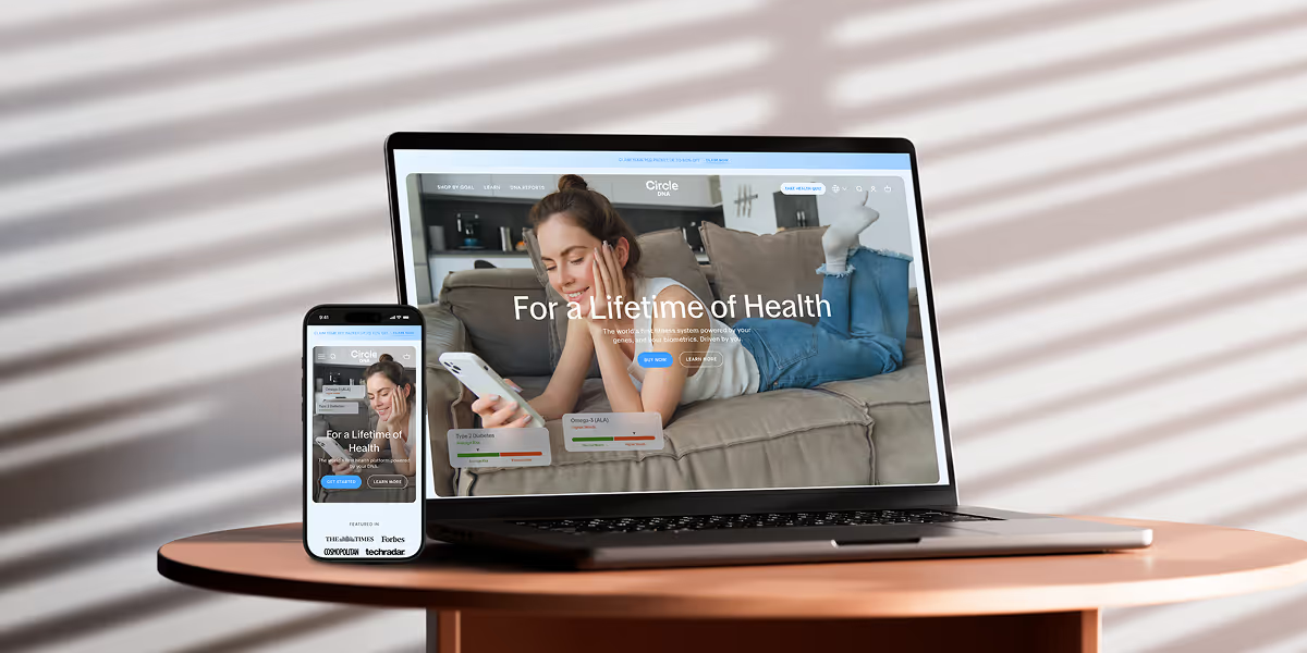
Circle DNA Website Mockup for Mobile and Desktop

CircleDNA

Revamped website to boost conversions & refresh brand identity.
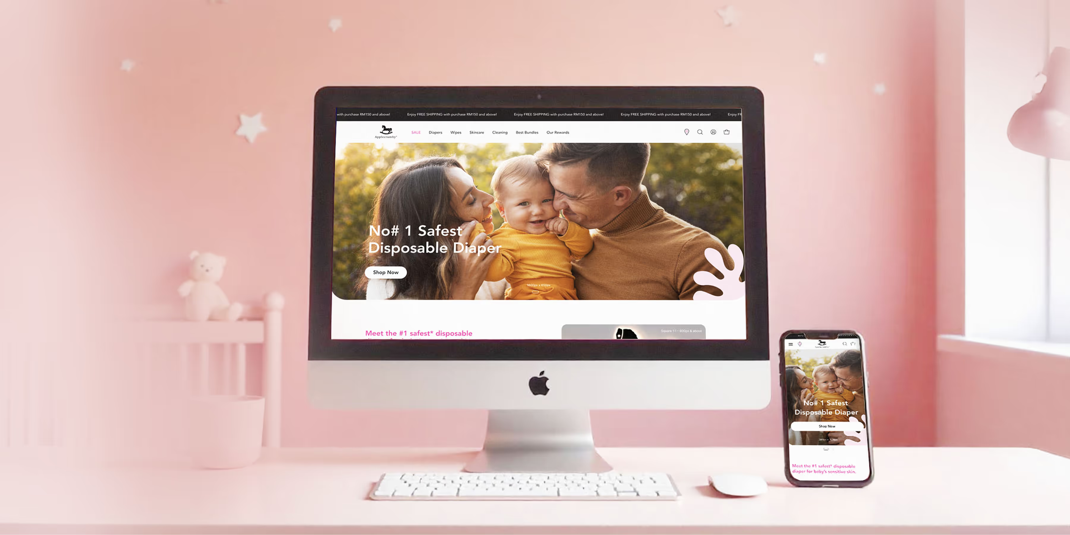
Applecrumby E-commerce Website Built Mockup for Mobile and Desktop

Applecrumby

Strengthened brand storytelling to boost customer conversions.
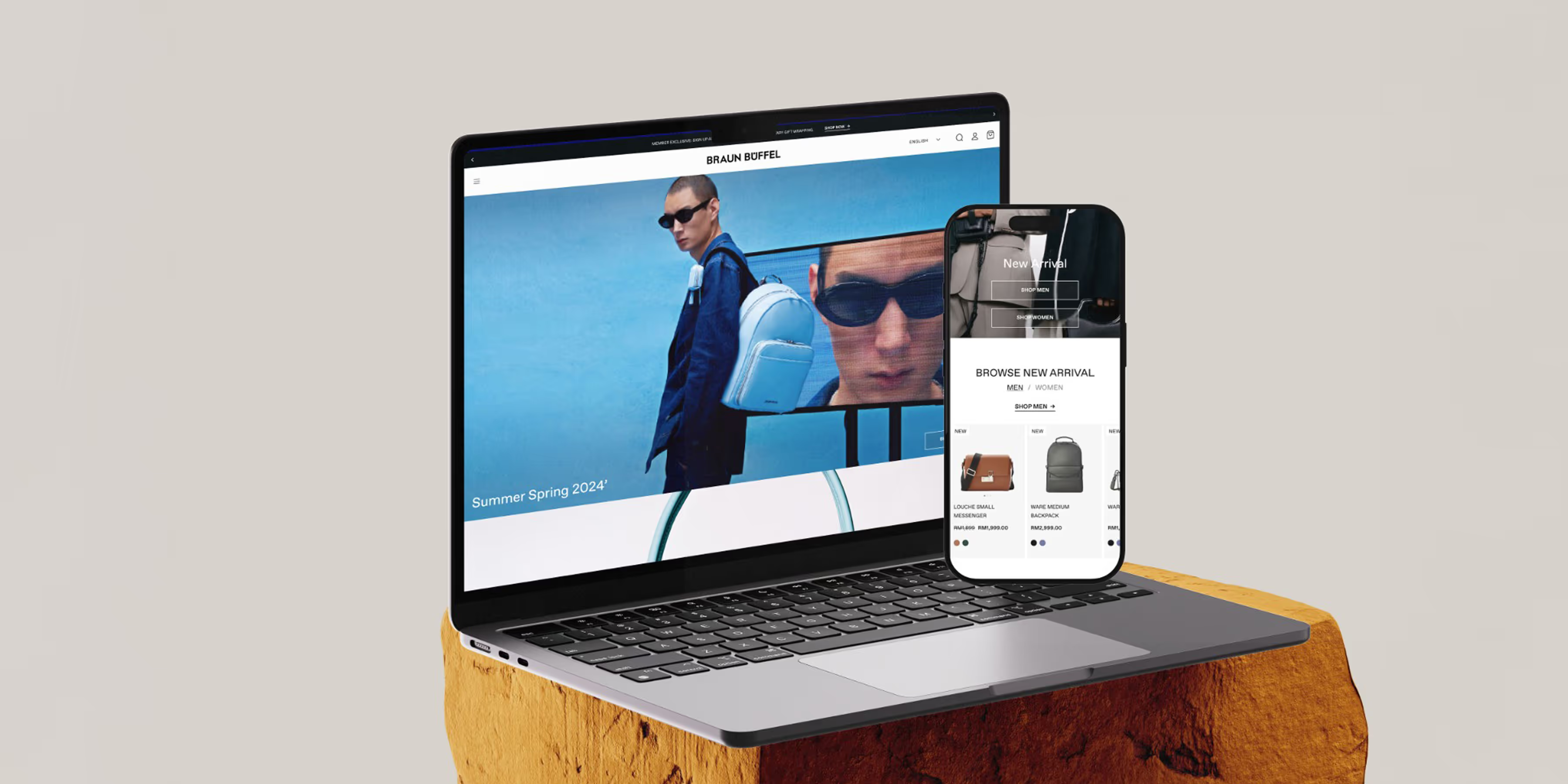
Braun Buffel Website Development Mockup for Mobile and Desktop

Braun Buffel

Strengthened brand and boosted conversions with strategic design.
Circle DNA Website Mockup for Mobile and Desktop

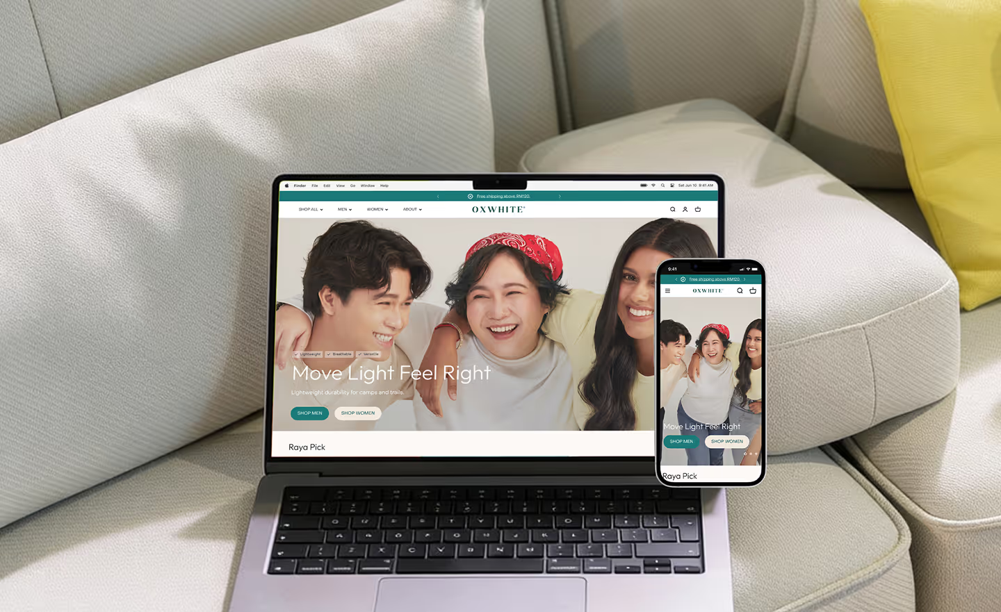
Oxwhite

Driving +25% AOV: Strategic UX and navigation for a minimalist lifestyle leader.
Circle DNA Website Mockup for Mobile and Desktop

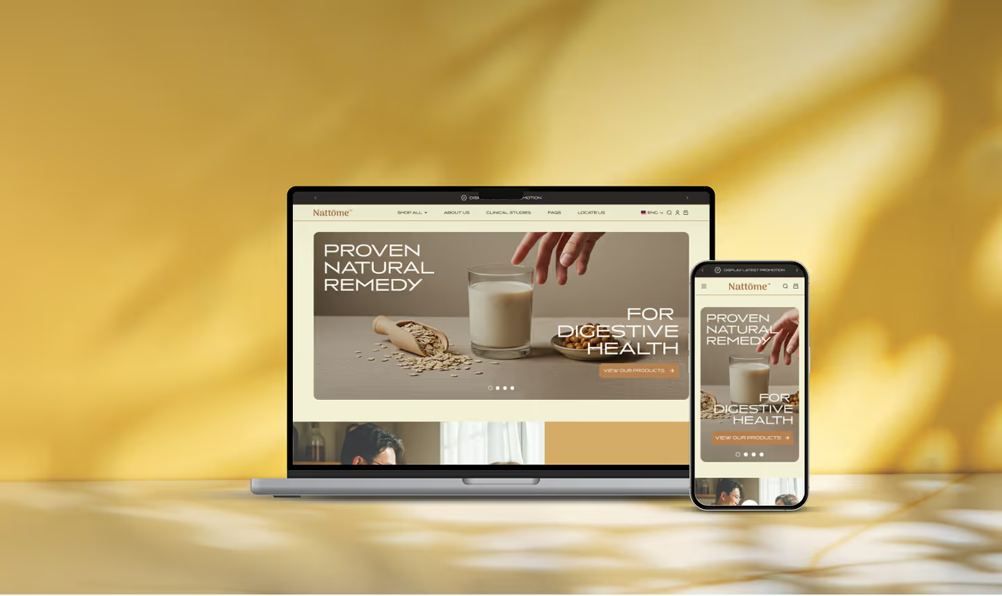
Nattome

Boosting Conversions by +40%: An education-first Shopify revamp for a natural health leader.
Circle DNA Website Mockup for Mobile and Desktop

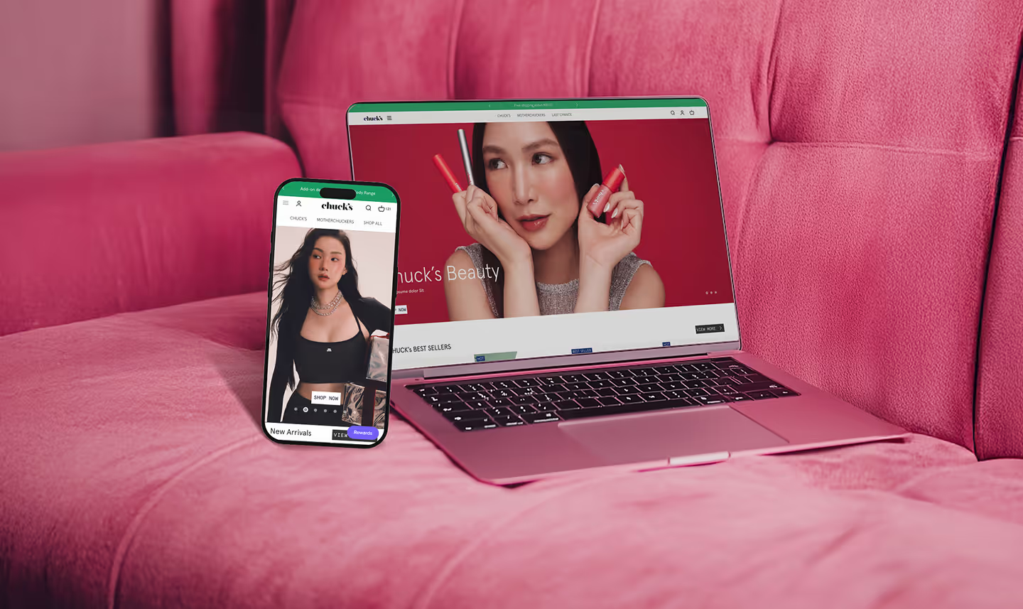
Chuck's

Scaling Sales by +89%: Transforming the storefront and UX hierarchy of a bold beauty disruptor.

Check Out @conversiondaryl

Roasting and fixing e-commerce websites, offering valuable marketing insights from a professional's perspective.

Nattome

The revamp introduces Nattome’s new identity through a modern, premium aesthetic. Our primary objective was to transition from passive browsing to a strategic, USP-driven user journey that utilises compelling storytelling to build immediate trust. By streamlining the path to purchase with intuitive navigation, the new design enables informed decision-making and friction-free conversion.

Get a Free 30-Minute Consultation

Thank you! Your submission has been received!
Oops! Something went wrong while submitting the form.