Speak to Z21
  • Actionable plan on how to grow your online sales
  • Industry-relevant case studies and benchmarks
  • Bounce ideas with our team
  • Enquire about Z21's services
Malaysia

Lachér Patisserie

Services

Conversion Rate Optimisation

Industry

Food & Beverage

Year

2026
First 6 months post-launch
+8.7%
Add-to-cart rate from flavour and audience filters
+8.7%
Add-to-cart rate from flavour and audience filters
+6.8%
Purchase rate from flavour and audience filters
+14%
Product card clicks from a mobile grid

This is a text when testiominal is not set up.

Lorem ipsum dolor sit amet, consectetur adipiscing elit. Suspendisse varius enim in eros elementum tristique.

Overview

CRO Case Study

Lachér Patisserie makes French-style cakes and tarts for delivery across Kuala Lumpur and Selangor, with a catalogue built around fulfilment windows: same-day if you order before the cut-off, one-day preorder for the rest, and petit gateaux on three days a week. That works for the kitchen, but a shopper is choosing a flavour and an occasion. Convx by Z21 ran conversion optimisation on Lachér's store.

No items found.
01
Expand +
Collapse -
+
-
Before
After
Before
After
Before
After

Heading 1

Heading 2

Heading 3

Heading 4

Heading 5
Heading 6

Lorem ipsum dolor sit amet, consectetur adipiscing elit, sed do eiusmod tempor incididunt ut labore et dolore magna aliqua. Ut enim ad minim veniam, quis nostrud exercitation ullamco laboris nisi ut aliquip ex ea commodo consequat. Duis aute irure dolor in reprehenderit in voluptate velit esse cillum dolore eu fugiat nulla pariatur.

Block quote

Ordered list

  1. test Item 1
  2. Item 2
  3. Item 3

Unordered list

  • Item A
  • Item B
  • Item C

Text link

Bold text

Emphasis

Superscript

Subscript

The Challenges

  1. A catalogue sorted by delivery time, not by taste

    Fifteen cakes were grouped by when they could be delivered, and the only filters were halal-certified and nut-free. Nothing let a shopper narrow the range by flavour or by who the cake was for.
  2. Search was not a way in

    Site search reached about one session in five hundred, so discovery depended on navigation, collection layout and filters.
  3. Mobile carousels hid most of the range

    Each collection section on mobile was a carousel showing one cake at a time. Attention dropped sharply after the fourth card, so most of the range was never seen.

Key Objectives

  1. Let shoppers narrow the range by taste, not by logistics
  2. Show more of the catalogue in the same scroll
  3. Prove every change against a live control

The Solution

  1. Filters built around how people choose cake

    Flavour and audience filters replaced a filter row that only served dietary needs.
  2. A collection layout that shows more at once

    A two-column grid on mobile in place of carousels that showed one cake at a time.
  3. Every change tested against a live control

    Around twenty A/B tests, each against a concurrent control on the live store. Roughly half produced a change worth keeping.

Filters That Match How People Choose Cake

The collection page filtered only by halal certification and nut-free. Useful if you have a dietary requirement, no help at all if you are simply trying to pick a cake. We replaced it with the filters people actually shop by: bestsellers, chocolatey, refreshing and fruity, nutty, classics, and who the cake is for, including kid-friendly and elderly-friendly.

Results:
+8.7% add-to-cart rate from the product listing
+6.8% purchase rate
+2.7% average order value

Engagement with the filter bar rose by close to half. The kick-off research predicted it: shoppers give up on a choice that gets difficult, and it gets difficult faster when every cake on the page looks good.

Cake collection page, before and after: a filter row offering only halal-certified and nut-free, replaced by filters for bestsellers, chocolatey, refreshing and fruity, nutty and classicsCake collection page, before and after: a filter row offering only halal-certified and nut-free, replaced by filters for bestsellers, chocolatey, refreshing and fruity, nutty and classics
No items found.
Mobile collection page, before and after: a carousel showing one cake at a time, replaced by a two-column grid showing six cakes in the same space
No items found.
Mobile collection page, before and after: a carousel showing one cake at a time, replaced by a two-column grid showing six cakes in the same space
No items found.

A Grid Instead Of A Carousel On Mobile

On mobile, each collection section was a carousel, with the rest of the range behind a sideways swipe. We tested a two-column grid that shows six cakes in the space that used to show one.

Results:
+14% product card clicks
+6.4% add-to-cart rate
purchase rate up roughly 2%

The grid won even though every product image got smaller. Seeing the range mattered more than seeing any one cake up close. Average order value fell slightly, so this is a discovery and add-to-cart win, not a basket-size one.

No items found.

Results That Speak for Themselves

We focus on tangible outcomes—not just design for design’s sake. Here’s what our clients typically see after we launch or revamp their Shopify websites:
+8.7%
Add-to-cart rate from flavour and audience filters
+6.8%
Purchase rate from flavour and audience filters
+14%
Product card clicks from a mobile grid
Better user experience = better results across sales and marketing performance, including higher ROAS for ad campaigns.

The Challenges

  1. A catalogue sorted by delivery time, not by taste

    Fifteen cakes were grouped by when they could be delivered, and the only filters were halal-certified and nut-free. Nothing let a shopper narrow the range by flavour or by who the cake was for.
  2. Search was not a way in

    Site search reached about one session in five hundred, so discovery depended on navigation, collection layout and filters.
  3. Mobile carousels hid most of the range

    Each collection section on mobile was a carousel showing one cake at a time. Attention dropped sharply after the fourth card, so most of the range was never seen.

Key Objectives

  1. Let shoppers narrow the range by taste, not by logistics
  2. Show more of the catalogue in the same scroll
  3. Prove every change against a live control

The Solution

  1. Filters built around how people choose cake

    Flavour and audience filters replaced a filter row that only served dietary needs.
  2. A collection layout that shows more at once

    A two-column grid on mobile in place of carousels that showed one cake at a time.
  3. Every change tested against a live control

    Around twenty A/B tests, each against a concurrent control on the live store. Roughly half produced a change worth keeping.

Filters That Match How People Choose Cake

The collection page filtered only by halal certification and nut-free. Useful if you have a dietary requirement, no help at all if you are simply trying to pick a cake. We replaced it with the filters people actually shop by: bestsellers, chocolatey, refreshing and fruity, nutty, classics, and who the cake is for, including kid-friendly and elderly-friendly.

Results:
+8.7% add-to-cart rate from the product listing
+6.8% purchase rate
+2.7% average order value

Engagement with the filter bar rose by close to half. The kick-off research predicted it: shoppers give up on a choice that gets difficult, and it gets difficult faster when every cake on the page looks good.

Cake collection page, before and after: a filter row offering only halal-certified and nut-free, replaced by filters for bestsellers, chocolatey, refreshing and fruity, nutty and classicsCake collection page, before and after: a filter row offering only halal-certified and nut-free, replaced by filters for bestsellers, chocolatey, refreshing and fruity, nutty and classics
No items found.

Interested in working with us?

Book a 30-minute discovery call with us and find you best quotation.

Book a Call

More of Our Works

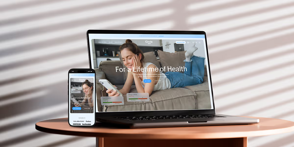
Circle DNA Website Mockup for Mobile and Desktop

CircleDNA

Revamped website to boost conversions & refresh brand identity.
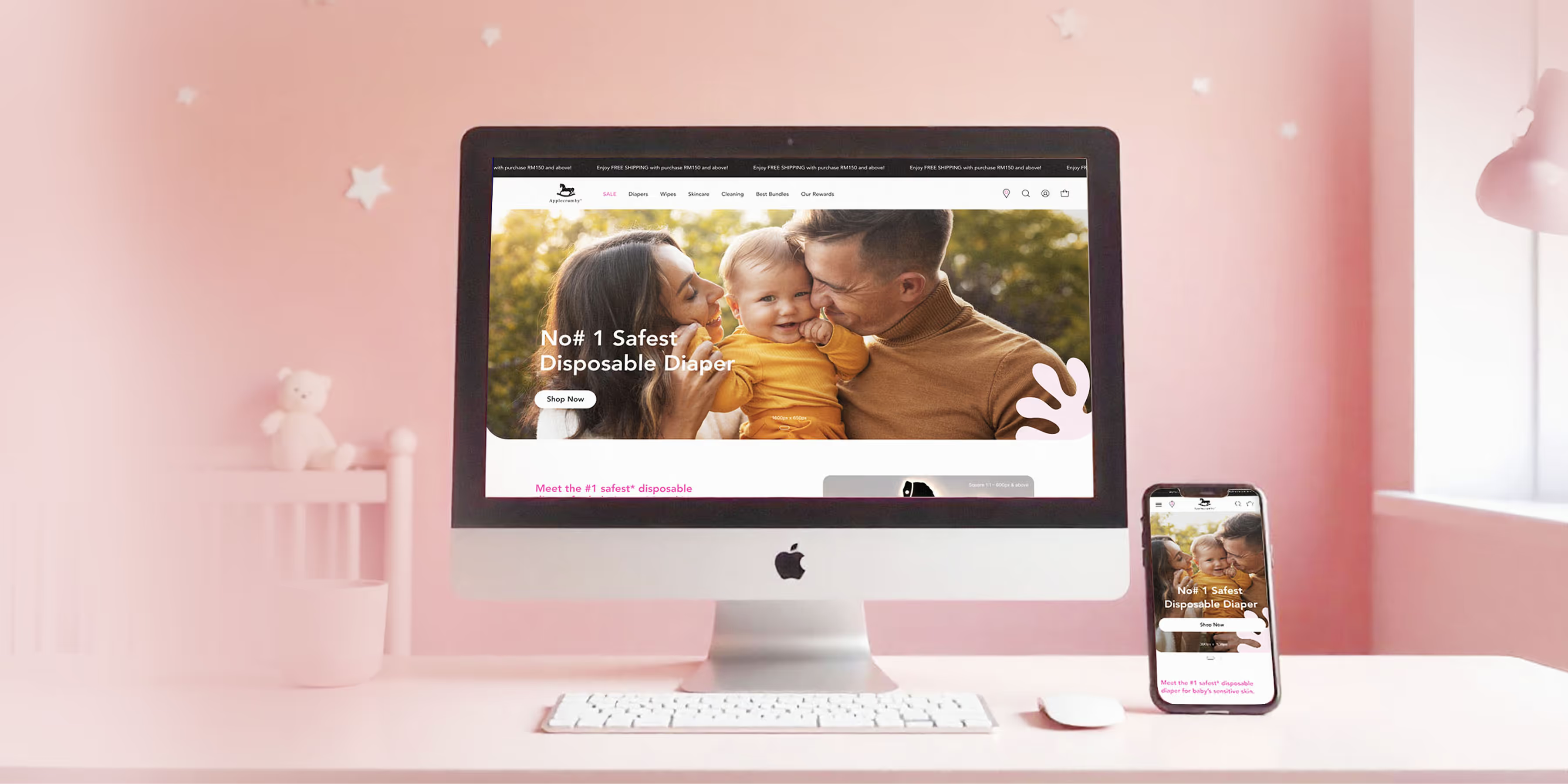
Applecrumby E-commerce Website Built Mockup for Mobile and Desktop

Applecrumby

Strengthened brand storytelling to boost customer conversions.
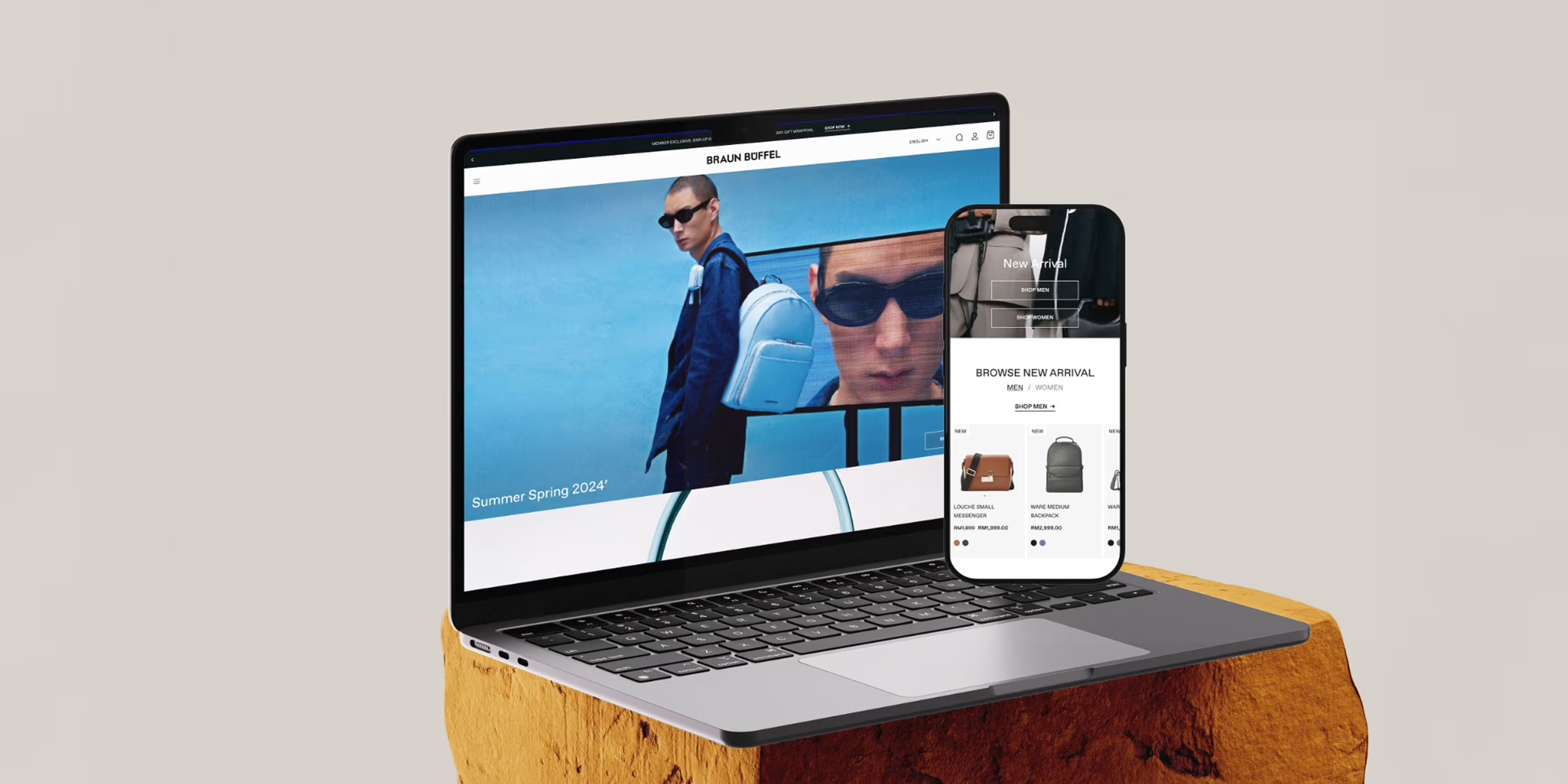
Braun Buffel Website Development Mockup for Mobile and Desktop

Braun Buffel

Strengthened brand and boosted conversions with strategic design.
Circle DNA Website Mockup for Mobile and Desktop

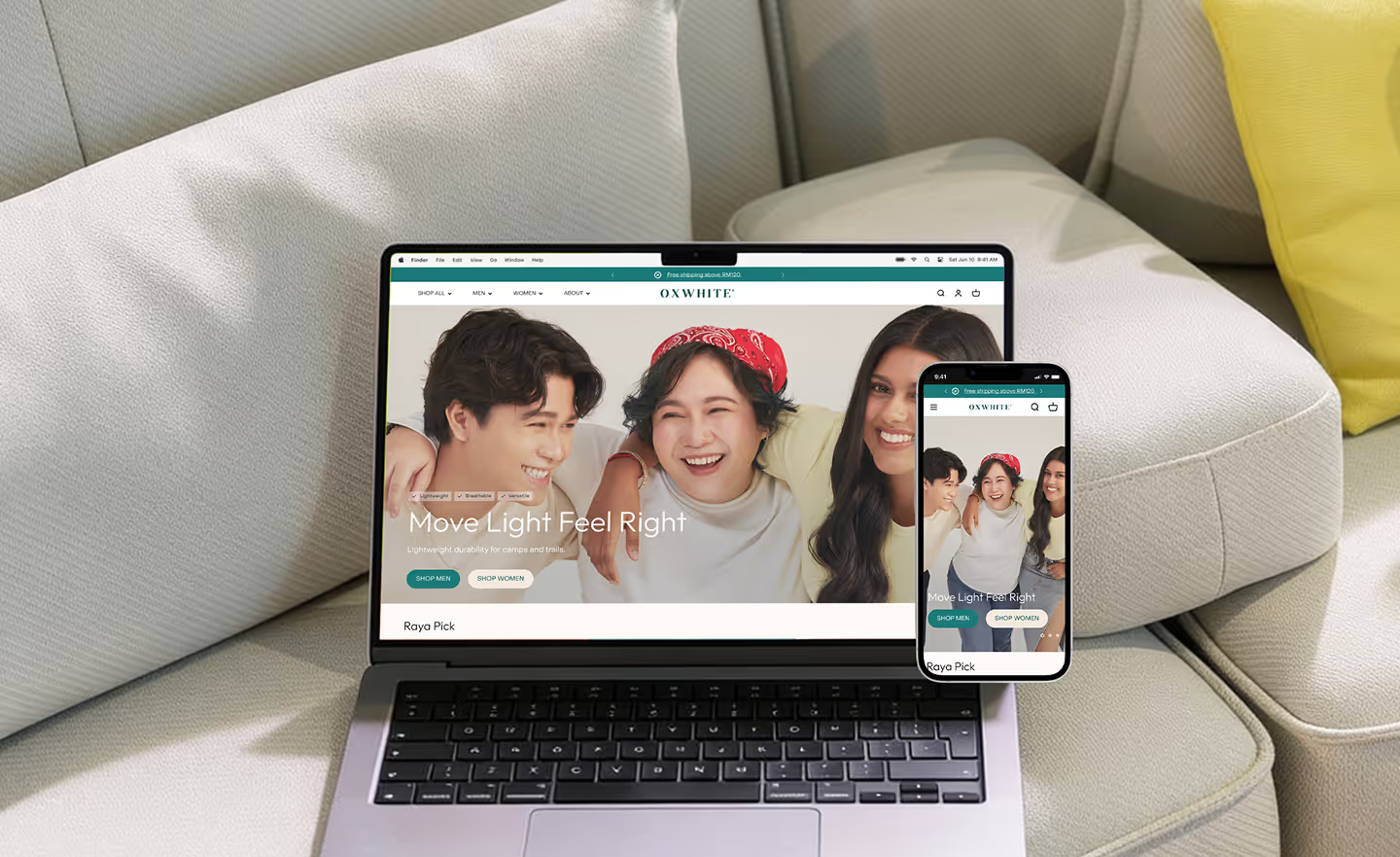
Oxwhite

Driving +25% AOV: Strategic UX and navigation for a minimalist lifestyle leader.
Circle DNA Website Mockup for Mobile and Desktop

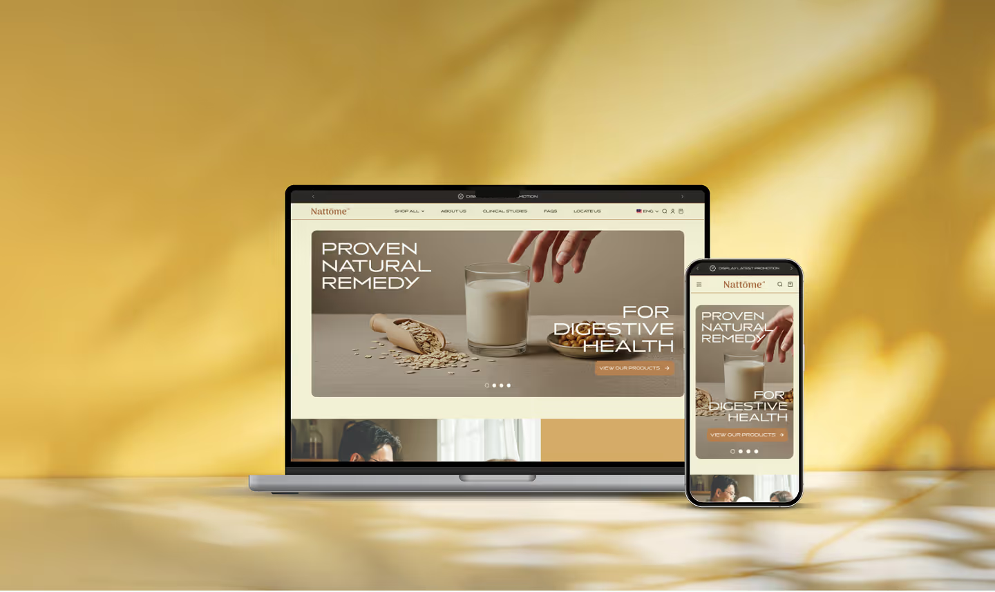
Nattome

Boosting Conversions by +40%: An education-first Shopify revamp for a natural health leader.
Circle DNA Website Mockup for Mobile and Desktop

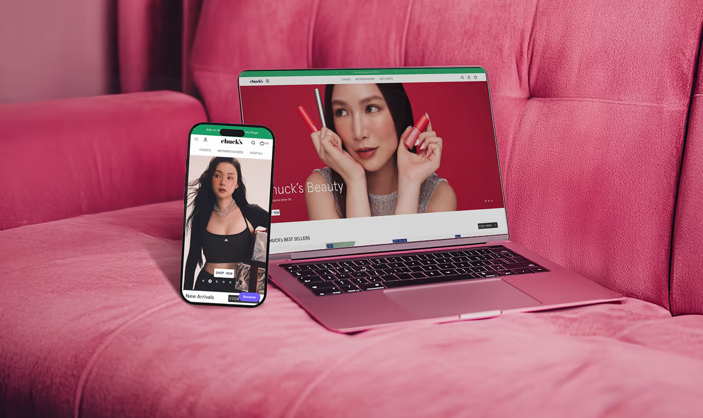
Chuck's

Scaling Sales by +89%: Transforming the storefront and UX hierarchy of a bold beauty disruptor.

Check Out @conversiondaryl

Roasting and fixing e-commerce websites, offering valuable marketing insights from a professional's perspective.

Lachér Patisserie

Lachér Patisserie makes French-style cakes and tarts for delivery across Kuala Lumpur and Selangor, with a catalogue built around fulfilment windows: same-day if you order before the cut-off, one-day preorder for the rest, and petit gateaux on three days a week. That works for the kitchen, but a shopper is choosing a flavour and an occasion. Convx by Z21 ran conversion optimisation on Lachér's store.

Get a Free 30-Minute Consultation

Thank you! Your submission has been received!
Oops! Something went wrong while submitting the form.