Speak to Z21
  • Actionable plan on how to grow your online sales
  • Industry-relevant case studies and benchmarks
  • Bounce ideas with our team
  • Enquire about Z21's services
Singapore & Malaysia

FLYCO

Services

CRO

Industry

Travel & Luggage

Year

2026
First 3 months post-launch
+53%
Total Sales Revenue
+53%
Total Sales Revenue
+40%
Conversion Rate
+43%
Add-to-Cart Rate

This is a text when testiominal is not set up.

Lorem ipsum dolor sit amet, consectetur adipiscing elit. Suspendisse varius enim in eros elementum tristique.

Overview

CRO Case Study

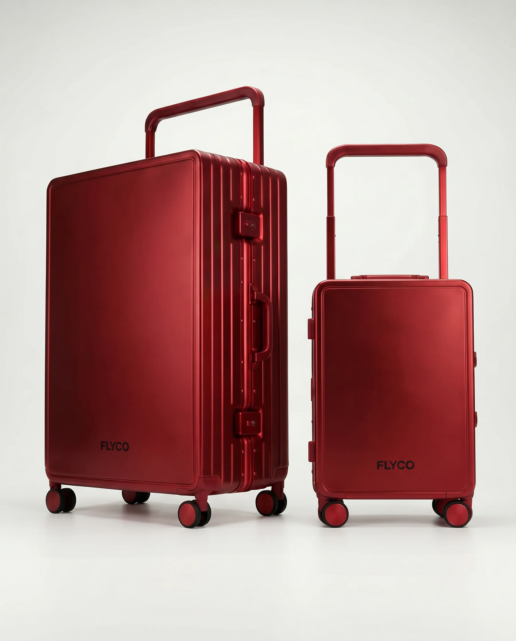
FLYCO is a Malaysian DTC luggage brand built around one differentiator: full personalisation. Every bag is customised with the buyer's name, handle colour, wheel colour, font colour, and luggage colour. The brand targets frequent flyers and creators across Malaysia and Singapore -- competing on identity, not price. Premium aluminium-framed, polycarbonate-built luggage backed by a lifetime warranty.

No items found.
Before
After
Before
After
Before
After

Heading 1

Heading 2

Heading 3

Heading 4

Heading 5
Heading 6

Lorem ipsum dolor sit amet, consectetur adipiscing elit, sed do eiusmod tempor incididunt ut labore et dolore magna aliqua. Ut enim ad minim veniam, quis nostrud exercitation ullamco laboris nisi ut aliquip ex ea commodo consequat. Duis aute irure dolor in reprehenderit in voluptate velit esse cillum dolore eu fugiat nulla pariatur.

Block quote

Ordered list

  1. test Item 1
  2. Item 2
  3. Item 3

Unordered list

  • Item A
  • Item B
  • Item C

Text link

Bold text

Emphasis

Superscript

Subscript

The Challenges

  1. High Customisation Complexity

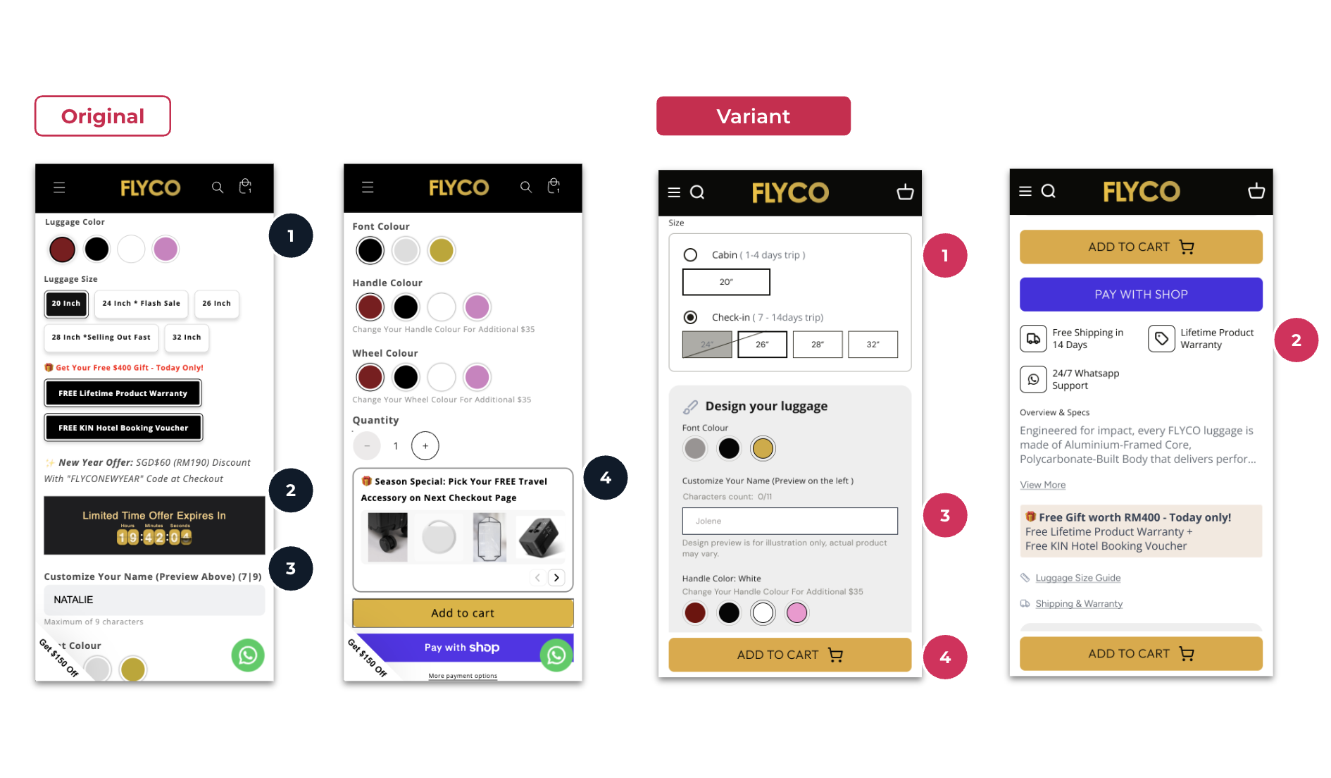
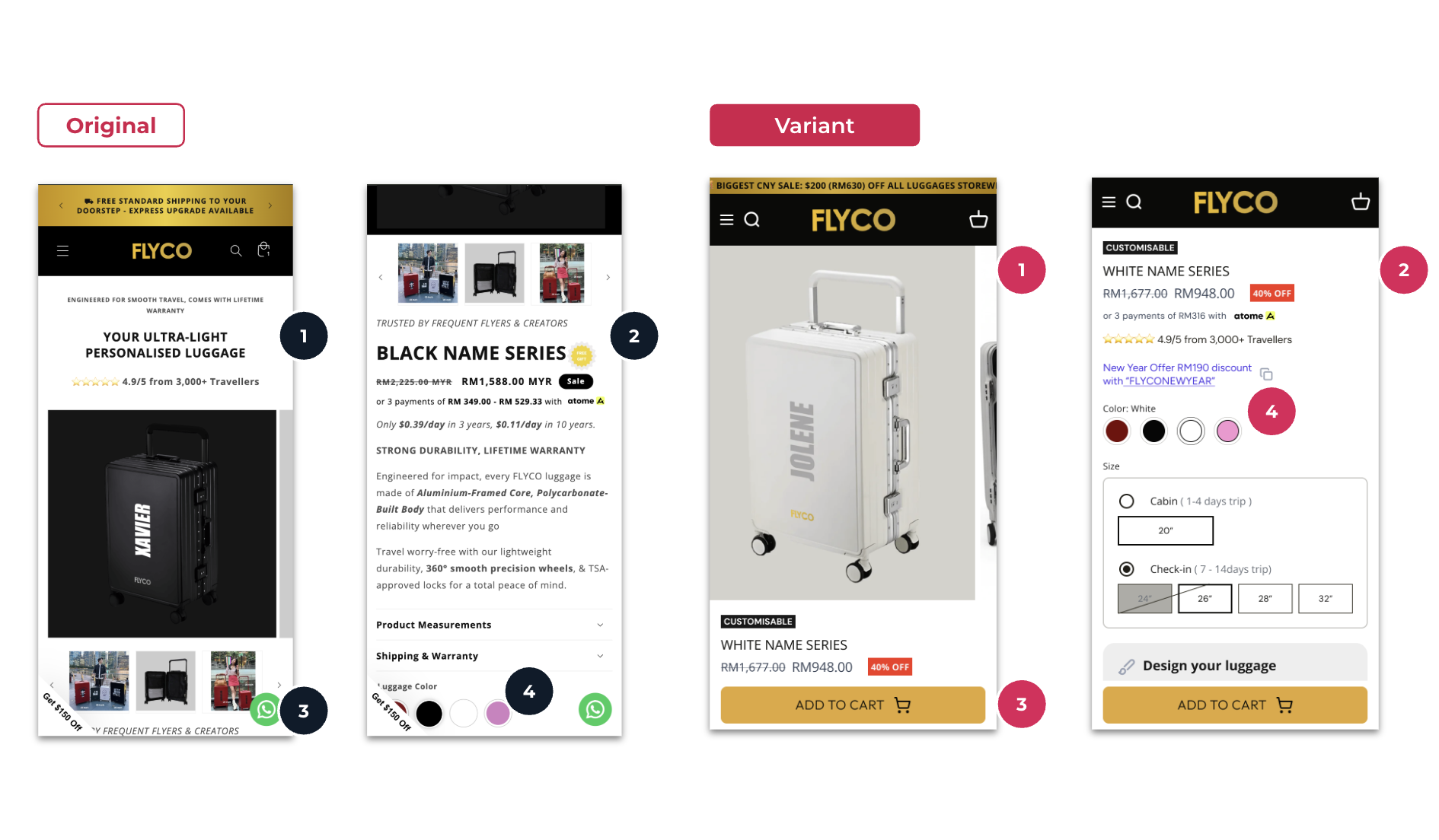
    FLYCO's PDP had 5 distinct customisation selectors displayed simultaneously — luggage colour, handle colour, wheel colour, font colour, and name input. The flat, unstructured layout created decision paralysis and overwhelmed first-time visitors who hadn't yet decided on size or colour.
  2. Trust & Social Proof Gaps

    Despite strong reviews (4.9/5 from 3,000+ travellers) and a compelling lifetime warranty offer, these credentials were buried below the fold and visually de-emphasised. A countdown timer was cannibalising the trust block space, driving anxiety rather than confidence.
  3. No Clear Visual Hierarchy

    The above-the-fold section led with marketing copy and a dark product image rather than an identity-led visual. Colour options were not visible without scrolling. The layout competed with itself — product imagery, promo text, BNPL details, and trust icons all fought for equal attention.

Key Objectives

  1. Drive Conversion Rate by 2x

    Double the store's conversion rate within 30 days through page-level optimisation alone -- no changes to paid media spend or traffic volume. Every initiative had to earn its place by directly reducing friction on the path to purchase.
  2. Reduce Purchase Friction

    Restructure the customisation flow so that high-priority decisions (size, colour, name) are surfaced first, secondary options are deferred, and the path from intent to Add-to-Cart requires fewer cognitive steps and less scroll depth.
  3. Build a Conversion Foundation

    Implement CRO best practices that go beyond this engagement: clear visual hierarchy, trust architecture, copy discipline, and a variant selector framework that scales as FLYCO expands its product range.

The Solution

  1. First Impressions Were Costing Sales

    Rebuilt the hero around product identity — visuals first, colour selectors and trust signals visible before the first scroll. 
  2. Information Overload Was Stalling Decisions

    Established a strict reading hierarchy — one idea per zone, whitespace as a conversion tool, icons over paragraphs.
  3. "20 Inch" Means Nothing. "Cabin (1-4 days)" Does.

    Reframed size selection around trip intent, not dimensions — eliminating the #1 hesitation for first-time buyers.

PDP Hero Optimization (Above-the-Fold)

First screen of the product page was overloaded and pushed key actions below the fold. The hero was simplified to highlight only decision-critical content (product name, one-line value proposition, and trust signal), while details were reorganized into scannable sections. Add-to-cart was kept within thumb reach, and colour selection was surfaced above the fold to reduce scrolling.

No items found.
No items found.
No items found.

Variants & Customisation Optimization

The product customization experience required shoppers to make multiple decisions at once, creating unnecessary friction before checkout. To solve this, selectors were restructured into a guided sequence (size → customise → add to cart), trust signals were made more visible, and name personalization was moved into a dedicated section for faster configuration.

No items found.

Results That Speak for Themselves

We focus on tangible outcomes—not just design for design’s sake. Here’s what our clients typically see after we launch or revamp their Shopify websites:
+53%
Total Sales Revenue
+40%
Conversion Rate
+43%
Add-to-Cart Rate
Better user experience = better results across sales and marketing performance, including higher ROAS for ad campaigns.

The Challenges

  1. High Customisation Complexity

    FLYCO's PDP had 5 distinct customisation selectors displayed simultaneously — luggage colour, handle colour, wheel colour, font colour, and name input. The flat, unstructured layout created decision paralysis and overwhelmed first-time visitors who hadn't yet decided on size or colour.
  2. Trust & Social Proof Gaps

    Despite strong reviews (4.9/5 from 3,000+ travellers) and a compelling lifetime warranty offer, these credentials were buried below the fold and visually de-emphasised. A countdown timer was cannibalising the trust block space, driving anxiety rather than confidence.
  3. No Clear Visual Hierarchy

    The above-the-fold section led with marketing copy and a dark product image rather than an identity-led visual. Colour options were not visible without scrolling. The layout competed with itself — product imagery, promo text, BNPL details, and trust icons all fought for equal attention.

Key Objectives

  1. Drive Conversion Rate by 2x

    Double the store's conversion rate within 30 days through page-level optimisation alone -- no changes to paid media spend or traffic volume. Every initiative had to earn its place by directly reducing friction on the path to purchase.
  2. Reduce Purchase Friction

    Restructure the customisation flow so that high-priority decisions (size, colour, name) are surfaced first, secondary options are deferred, and the path from intent to Add-to-Cart requires fewer cognitive steps and less scroll depth.
  3. Build a Conversion Foundation

    Implement CRO best practices that go beyond this engagement: clear visual hierarchy, trust architecture, copy discipline, and a variant selector framework that scales as FLYCO expands its product range.

The Solution

  1. First Impressions Were Costing Sales

    Rebuilt the hero around product identity — visuals first, colour selectors and trust signals visible before the first scroll. 
  2. Information Overload Was Stalling Decisions

    Established a strict reading hierarchy — one idea per zone, whitespace as a conversion tool, icons over paragraphs.
  3. "20 Inch" Means Nothing. "Cabin (1-4 days)" Does.

    Reframed size selection around trip intent, not dimensions — eliminating the #1 hesitation for first-time buyers.

PDP Hero Optimization (Above-the-Fold)

First screen of the product page was overloaded and pushed key actions below the fold. The hero was simplified to highlight only decision-critical content (product name, one-line value proposition, and trust signal), while details were reorganized into scannable sections. Add-to-cart was kept within thumb reach, and colour selection was surfaced above the fold to reduce scrolling.

No items found.

Interested in working with us?

Book a 30-minute discovery call with us and find you best quotation.

Book a Call

More of Our Works

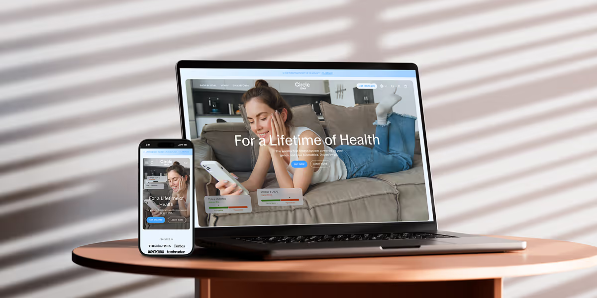
Circle DNA Website Mockup for Mobile and Desktop

CircleDNA

Revamped website to boost conversions & refresh brand identity.
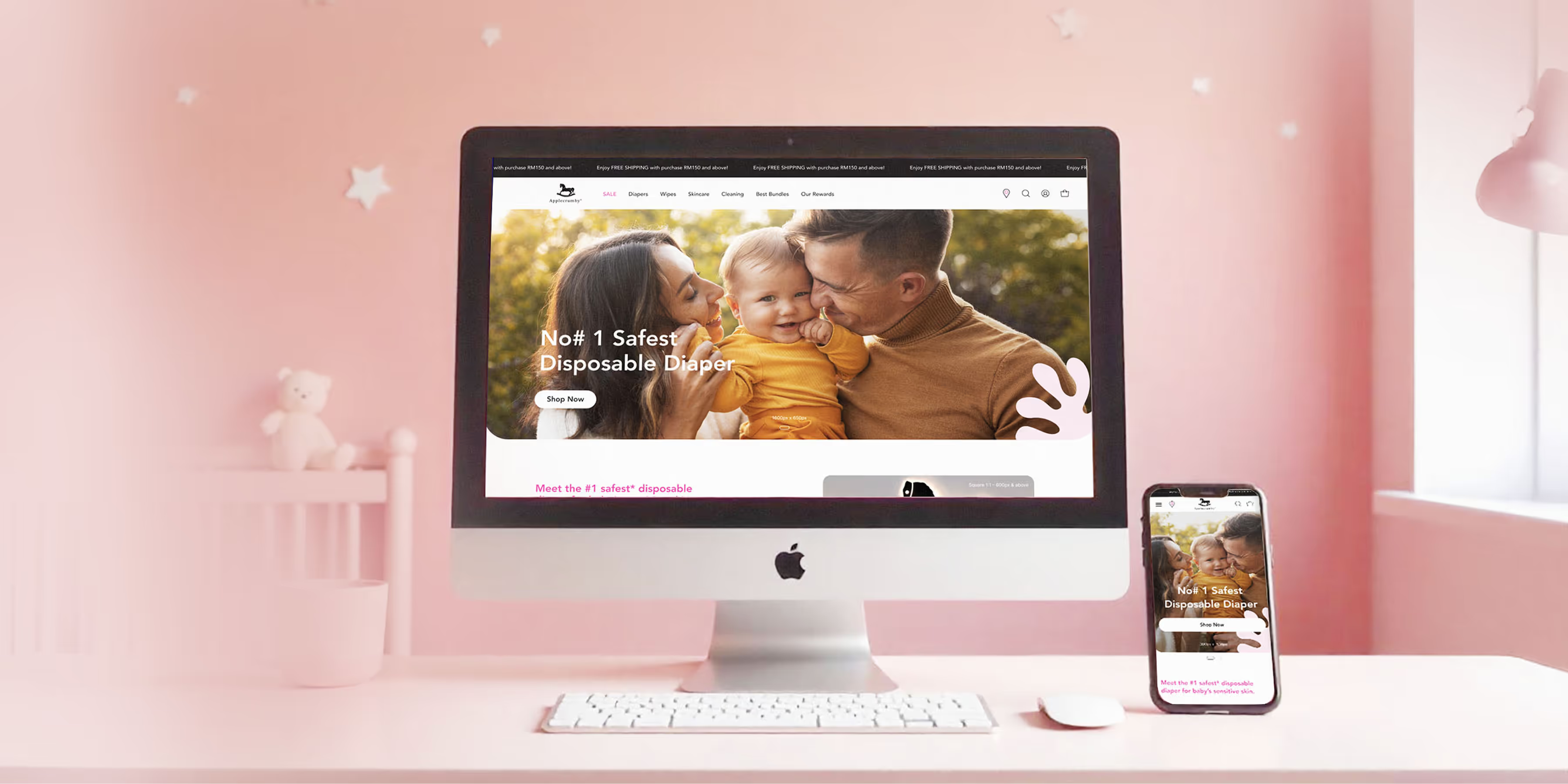
Applecrumby E-commerce Website Built Mockup for Mobile and Desktop

Applecrumby

Strengthened brand storytelling to boost customer conversions.
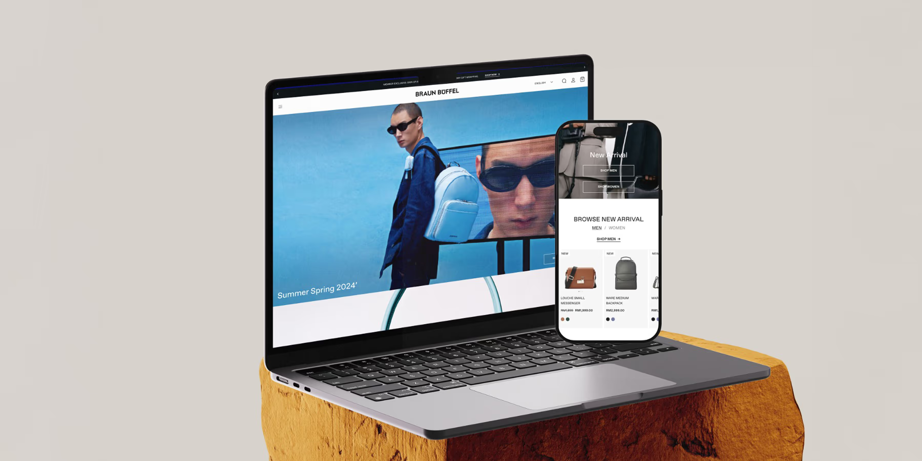
Braun Buffel Website Development Mockup for Mobile and Desktop

Braun Buffel

Strengthened brand and boosted conversions with strategic design.
Circle DNA Website Mockup for Mobile and Desktop

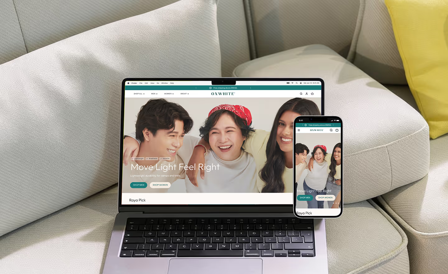
Oxwhite

Driving +25% AOV: Strategic UX and navigation for a minimalist lifestyle leader.
Circle DNA Website Mockup for Mobile and Desktop

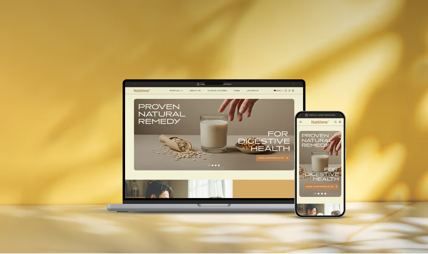
Nattome

Boosting Conversions by +40%: An education-first Shopify revamp for a natural health leader.
Circle DNA Website Mockup for Mobile and Desktop

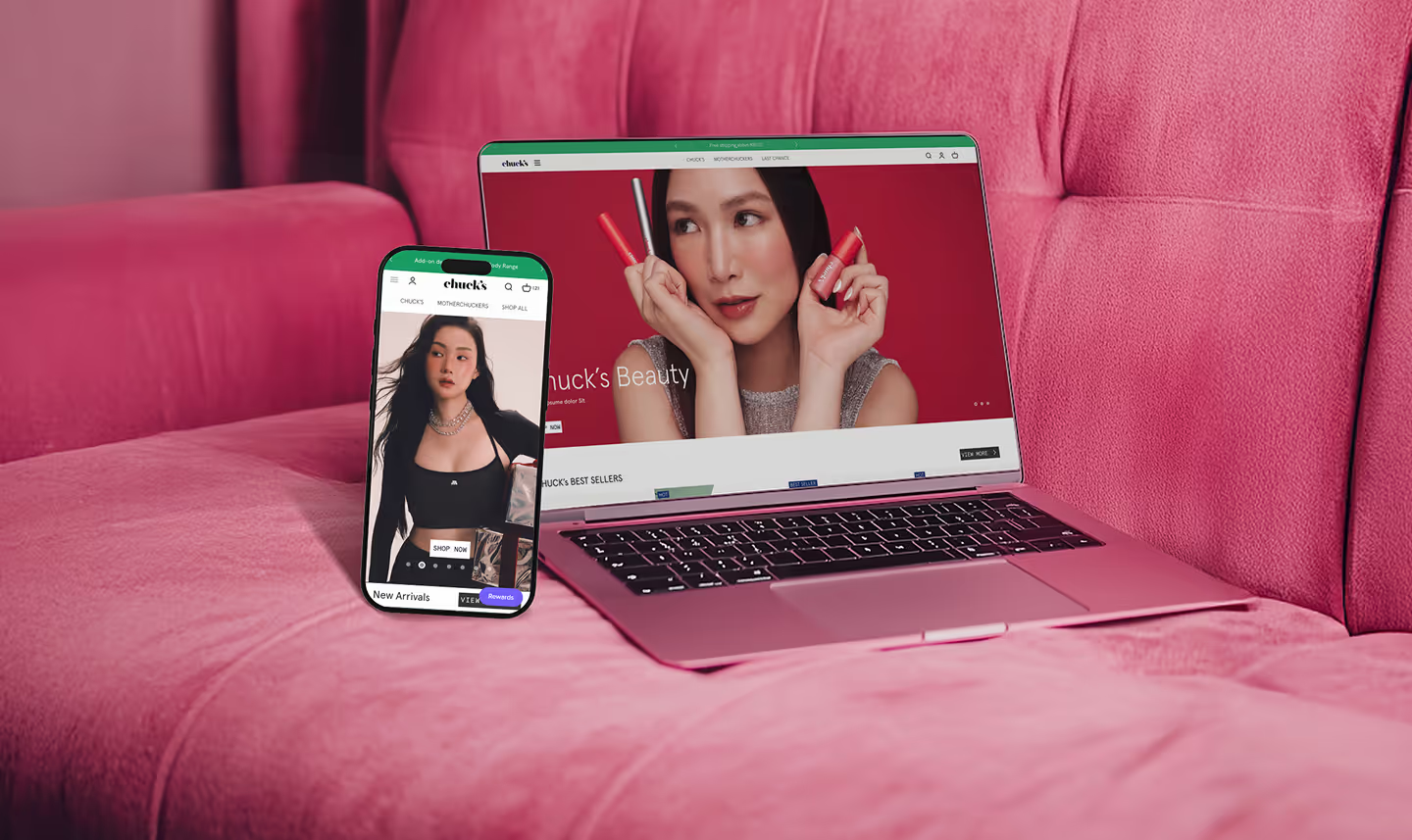
Chuck's

Scaling Sales by +89%: Transforming the storefront and UX hierarchy of a bold beauty disruptor.

Check Out @conversiondaryl

Roasting and fixing e-commerce websites, offering valuable marketing insights from a professional's perspective.

Flyco

FLYCO is a Malaysian DTC luggage brand built around one differentiator: full personalisation. Every bag is customised with the buyer's name, handle colour, wheel colour, font colour, and luggage colour. The brand targets frequent flyers and creators across Malaysia and Singapore -- competing on identity, not price. Premium aluminium-framed, polycarbonate-built luggage backed by a lifetime warranty.

Get a Free 30-Minute Consultation

Thank you! Your submission has been received!
Oops! Something went wrong while submitting the form.