Clarks
Services
Industry
Year
Services
UI/UX Design (Desktop & Mobile)
Shopify Frontend Development
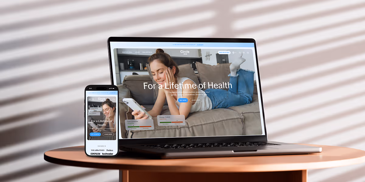
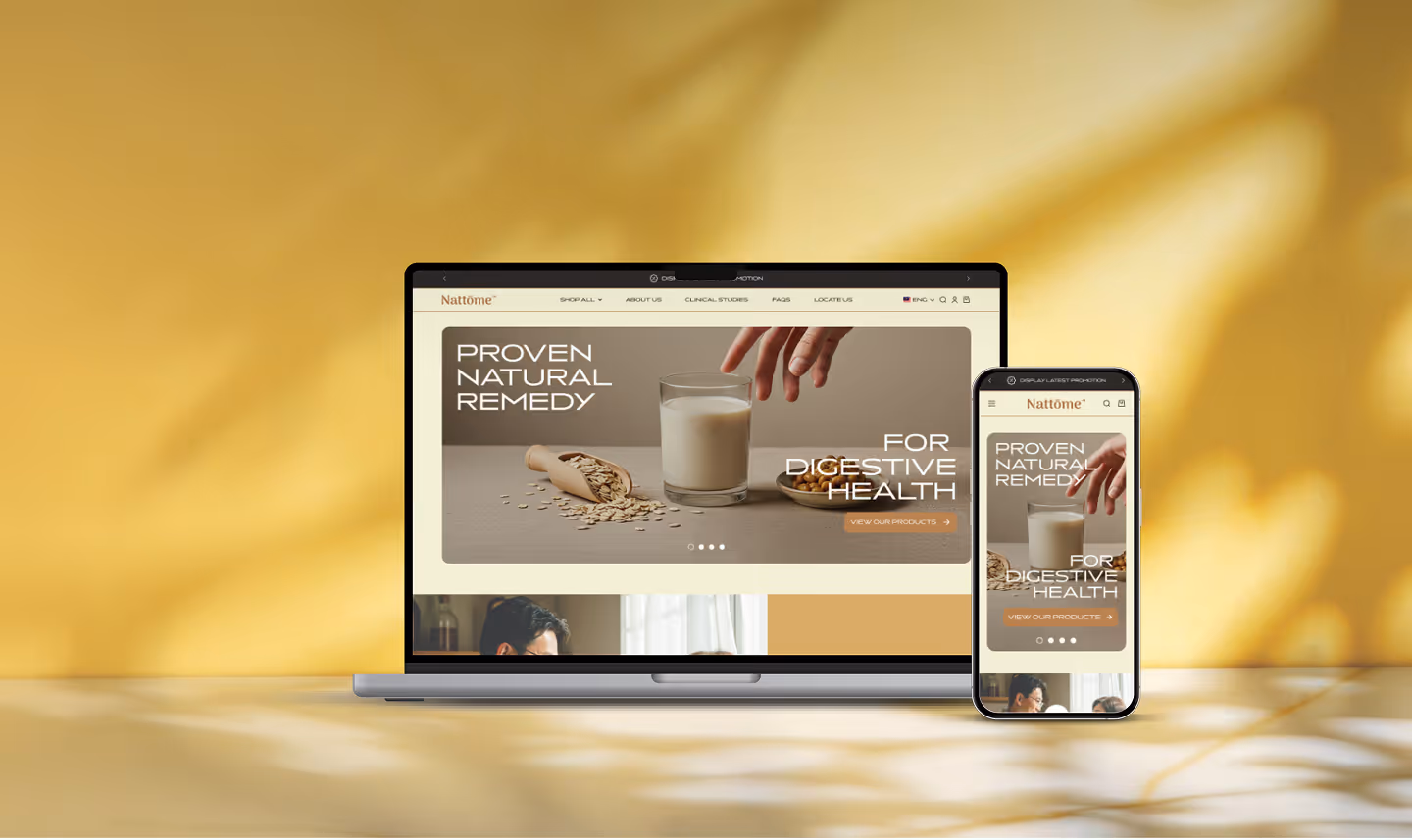
Homepage Design
The homepage underwent a complete revamp to optimize its design for both desktop and mobile devices, ensuring a seamless user journey. The goal was to enhance the user experience on various platforms and drive sales by providing a visually appealing and user-friendly interface. To fine-tune the shopping process, a collection row was created, allowing easy access to key collections.
This update ensures that the most popular product categories or collections are prominently displayed, attracting more traffic and boosting sales.


Product Page Design
Our focus lies in ensuring the visibility of products through a suitable Grid arrangement that allows consumers to quickly and easily view the shoes in a horizontal or desktop view. Additionally, we recommend utilizing a single convert button to streamline the purchasing process, removing any distractions or friction associated with multiple consumer behavior buttons.
By prioritizing the important details at the top of the pages, images were strategically placed at the bottom section, serving as an added value that effectively illustrates the unique selling points of the product.

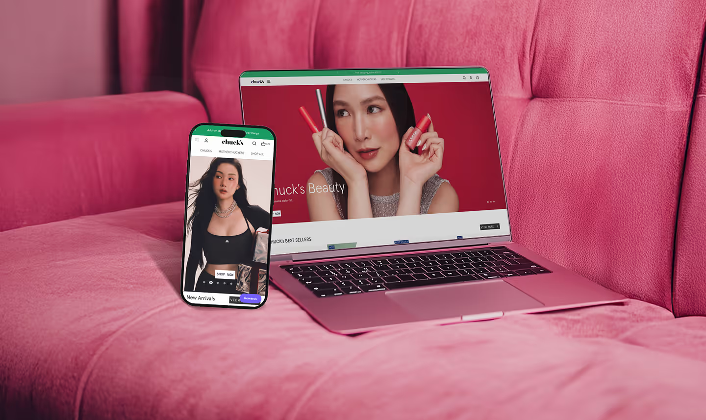
Collection Page
The previous website layout did not display product listings, leading to increased redirections and multiple back-and-forth actions to find the desired products. To address this issue, we have implemented a user-friendly solution by introducing reasonable placeholders and scrollable collections displayed in an icon style.This update significantly enhances the accessibility of browsing through the website, allowing users to easily locate and explore products without unnecessary clicking and navigation.
There are also small detailed we catered into factor of conversion rate, whereby adding important quick button, easy navigation and filteration for the page.
We have incorporated a filter feature for the page. These enhancements ensure that users can conveniently access desired information and products, ultimately improving the overall conversion rate.


.png)