Speak to Z21
  • Actionable plan on how to grow your online sales
  • Industry-relevant case studies and benchmarks
  • Bounce ideas with our team
  • Enquire about Z21's services
Singapore

CALECIM Professional

Services

Conversion Rate Optimisation

Industry

Skincare and Haircare

Year

2026
First 6 months post-launch
+18%
Rewards page conversion rate, at over 99% confidence
+18%
Rewards page conversion rate, at over 99% confidence
+13%
Subscription page conversion rate, at over 99% confidence
+35%
Account logins, at 100% confidence

This is a text when testiominal is not set up.

Lorem ipsum dolor sit amet, consectetur adipiscing elit. Suspendisse varius enim in eros elementum tristique.

Overview

CRO Case Study

CALECIM Professional is a Singapore skincare and haircare brand built on a patented stem-cell-derived active, selling direct to customers worldwide. Most of its sessions arrive on a phone, the basket is a considered purchase rather than an impulse one, and subscription is central to how the brand keeps customers. Convx by Z21 ran the conversion programme for CALECIM Professional, with every change tested against a concurrent control.

No items found.
01
Expand +
Collapse -
+
-
Before
After
Before
After
Before
After

Heading 1

Heading 2

Heading 3

Heading 4

Heading 5
Heading 6

Lorem ipsum dolor sit amet, consectetur adipiscing elit, sed do eiusmod tempor incididunt ut labore et dolore magna aliqua. Ut enim ad minim veniam, quis nostrud exercitation ullamco laboris nisi ut aliquip ex ea commodo consequat. Duis aute irure dolor in reprehenderit in voluptate velit esse cillum dolore eu fugiat nulla pariatur.

Block quote

Ordered list

  1. test Item 1
  2. Item 2
  3. Item 3

Unordered list

  • Item A
  • Item B
  • Item C

Text link

Bold text

Emphasis

Superscript

Subscript

The Challenges

  1. Mobile carried the traffic, not the conversion

    Most sessions arrived on a phone, and the phone converted at just over a fifth of the desktop rate. Any change that did not work on a small screen was not going to move the business.
  2. The best route through the store was the hardest to find

    The subscription page converted at roughly three times the site average, yet it was not in the menu. Neither was the rewards programme, and account access sat nested inside the About menu.
  3. New visitors had to believe it before they could buy it

    The range is clinical and the price is a considered decision. Proof, not urgency, was the lever available, and a first-time visitor has not yet decided the product works.

Key Objectives

  1. Fix the phone first
  2. Put the subscription and rewards paths within reach
  3. Learn which offers work on which audience

The Solution

  1. Diagnosis before design

    The menu work came from user feedback about what shoppers could not find. The subscription work came from the subscription page already being the store's best-converting route.
  2. Subscription for existing customers, not new visitors

    The retention work targeted people who already had a reason to come back. The acquisition work targeted people who still had to be convinced the product works.
  3. Every change ran against a concurrent control

    The ones that lost were held back and written up rather than quietly dropped, so the programme learned from them.

The Account And Rewards Paths Nobody Could Find

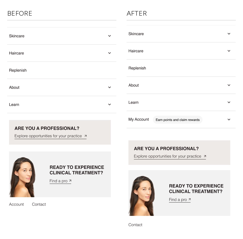
The rewards programme, account login and the subscription page all sat behind an About menu. That mattered because the subscription page already converted at roughly three times the site average, so the shortest route to a repeat customer was the one hardest to reach.

We promoted My Account to a top-level menu row and labelled it "Earn points and claim rewards". Opening it exposes register, login, the rewards club and the subscription page directly.

Results:
+18% conversion rate on the rewards page, at over 99% confidence
+13% conversion rate on the subscription page, at over 99% confidence
+35% account logins, at 100% confidence
+6% revenue
Deployed to all traffic straight after the test

It was the only test in the programme where every metric moved together at 99 to 100% confidence with nothing moving the other way. One menu row made the three things that bring a customer back reachable.

CALECIM Professional mobile menu, before and after: a five-item menu whose only account access is a small text link at the very bottom, replaced by the same menu with a My Account row promoted to the top level and labelled Earn points and claim rewardsCALECIM Professional mobile menu, before and after: a five-item menu whose only account access is a small text link at the very bottom, replaced by the same menu with a My Account row promoted to the top level and labelled Earn points and claim rewards
No items found.
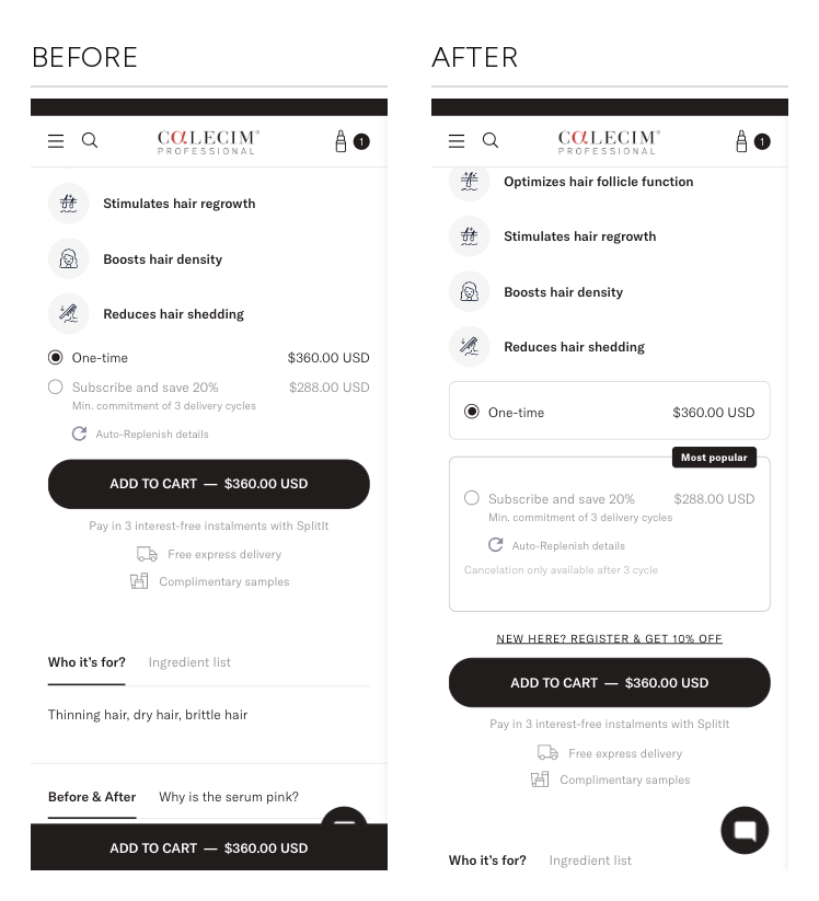
CALECIM Professional mobile hair product page buy box, before and after: two plain radio rows with the one-time option selected, replaced by two bordered cards with a Most popular badge on the subscription option, its cancellation terms shown, and a register-and-save prompt above Add to Cart
No items found.

The Test That Won Its Own Metric And Lost Money

Subscription was the best-converting route on the store, so we pushed it harder on first-time visitors to the hair product page. The variant restyled the buy box into two bordered cards, put a "Most popular" badge on the subscription option, added a register-and-save prompt above Add to Cart and surfaced the cancellation terms.

Results:
+82% subscribe clicks, at 100% confidence
-7% conversion rate
-9% purchases
-4% average order value
-8% revenue per visitor
Not deployed

Subscribe clicks rose and revenue went backwards. The click was the proxy, not the goal. A first-time visitor has not yet decided the product works, and asking them to commit to three delivery cycles stacks a second decision on top of one they have not finished making.

The same offer put in front of existing customers produced the strongest result in the programme. The variant changed several things at once, so the finding is the direction rather than the element.

No items found.

Results That Speak for Themselves

We focus on tangible outcomes—not just design for design’s sake. Here’s what our clients typically see after we launch or revamp their Shopify websites:
+18%
Rewards page conversion rate, at over 99% confidence
+13%
Subscription page conversion rate, at over 99% confidence
+35%
Account logins, at 100% confidence
Better user experience = better results across sales and marketing performance, including higher ROAS for ad campaigns.

The Challenges

  1. Mobile carried the traffic, not the conversion

    Most sessions arrived on a phone, and the phone converted at just over a fifth of the desktop rate. Any change that did not work on a small screen was not going to move the business.
  2. The best route through the store was the hardest to find

    The subscription page converted at roughly three times the site average, yet it was not in the menu. Neither was the rewards programme, and account access sat nested inside the About menu.
  3. New visitors had to believe it before they could buy it

    The range is clinical and the price is a considered decision. Proof, not urgency, was the lever available, and a first-time visitor has not yet decided the product works.

Key Objectives

  1. Fix the phone first
  2. Put the subscription and rewards paths within reach
  3. Learn which offers work on which audience

The Solution

  1. Diagnosis before design

    The menu work came from user feedback about what shoppers could not find. The subscription work came from the subscription page already being the store's best-converting route.
  2. Subscription for existing customers, not new visitors

    The retention work targeted people who already had a reason to come back. The acquisition work targeted people who still had to be convinced the product works.
  3. Every change ran against a concurrent control

    The ones that lost were held back and written up rather than quietly dropped, so the programme learned from them.

The Account And Rewards Paths Nobody Could Find

The rewards programme, account login and the subscription page all sat behind an About menu. That mattered because the subscription page already converted at roughly three times the site average, so the shortest route to a repeat customer was the one hardest to reach.

We promoted My Account to a top-level menu row and labelled it "Earn points and claim rewards". Opening it exposes register, login, the rewards club and the subscription page directly.

Results:
+18% conversion rate on the rewards page, at over 99% confidence
+13% conversion rate on the subscription page, at over 99% confidence
+35% account logins, at 100% confidence
+6% revenue
Deployed to all traffic straight after the test

It was the only test in the programme where every metric moved together at 99 to 100% confidence with nothing moving the other way. One menu row made the three things that bring a customer back reachable.

CALECIM Professional mobile menu, before and after: a five-item menu whose only account access is a small text link at the very bottom, replaced by the same menu with a My Account row promoted to the top level and labelled Earn points and claim rewardsCALECIM Professional mobile menu, before and after: a five-item menu whose only account access is a small text link at the very bottom, replaced by the same menu with a My Account row promoted to the top level and labelled Earn points and claim rewards
No items found.

Interested in working with us?

Book a 30-minute discovery call with us and find you best quotation.

Book a Call

More of Our Works

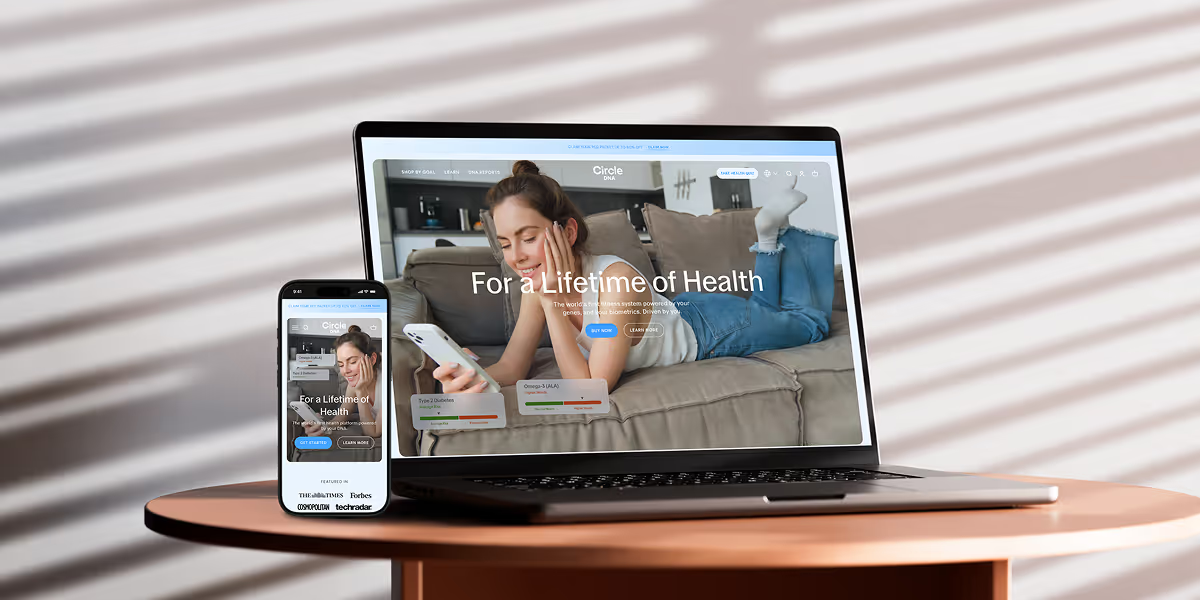
Circle DNA Website Mockup for Mobile and Desktop

CircleDNA

Revamped website to boost conversions & refresh brand identity.
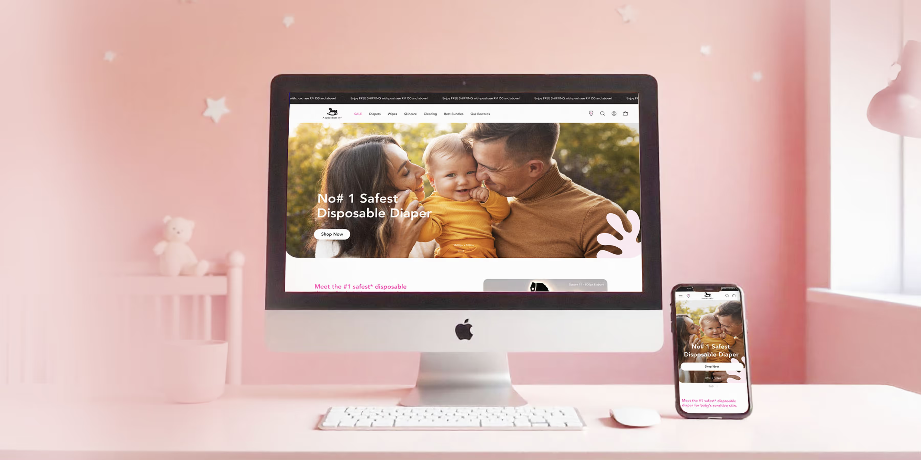
Applecrumby E-commerce Website Built Mockup for Mobile and Desktop

Applecrumby

Strengthened brand storytelling to boost customer conversions.
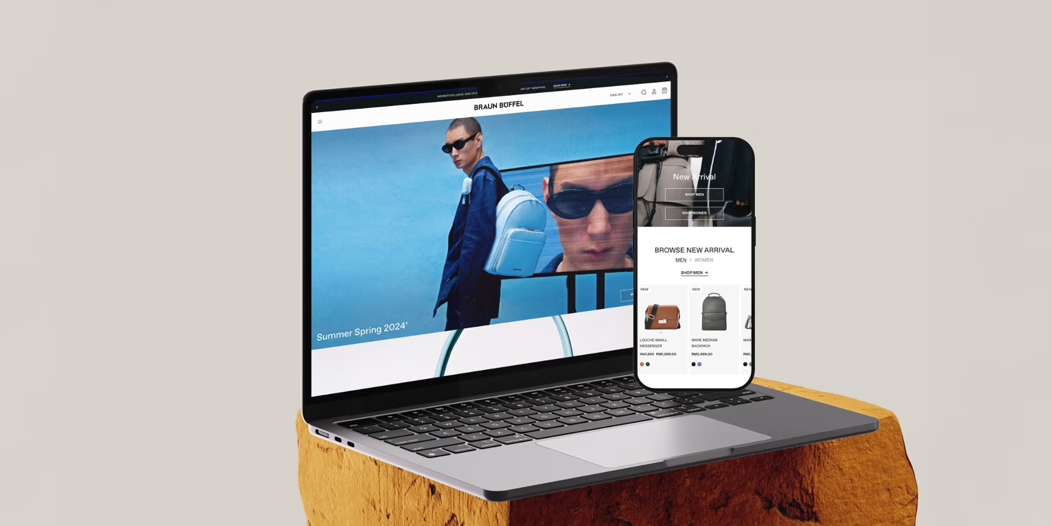
Braun Buffel Website Development Mockup for Mobile and Desktop

Braun Buffel

Strengthened brand and boosted conversions with strategic design.
Circle DNA Website Mockup for Mobile and Desktop

Oxwhite

Driving +25% AOV: Strategic UX and navigation for a minimalist lifestyle leader.
Circle DNA Website Mockup for Mobile and Desktop

Nattome

Boosting Conversions by +40%: An education-first Shopify revamp for a natural health leader.
Circle DNA Website Mockup for Mobile and Desktop

Chuck's

Scaling Sales by +89%: Transforming the storefront and UX hierarchy of a bold beauty disruptor.

Check Out @conversiondaryl

Roasting and fixing e-commerce websites, offering valuable marketing insights from a professional's perspective.

CALECIM Professional

CALECIM Professional is a Singapore skincare and haircare brand built on a patented stem-cell-derived active, selling direct to customers worldwide. Most of its sessions arrive on a phone, the basket is a considered purchase rather than an impulse one, and subscription is central to how the brand keeps customers. Convx by Z21 ran the conversion programme for CALECIM Professional, with every change tested against a concurrent control.

Get a Free 30-Minute Consultation

Thank you! Your submission has been received!
Oops! Something went wrong while submitting the form.