Speak to Z21
  • Actionable plan on how to grow your online sales
  • Industry-relevant case studies and benchmarks
  • Bounce ideas with our team
  • Enquire about Z21's services
Malaysia

Bayu Somerset

Services

CRO

Industry

Fashion

Year

2024
First 3 months post-launch
+11.6%
Checkout Rate
+11.6%
Checkout Rate
+5.1%
AOV
+RM2K
Incremental Revenue

This is a text when testiominal is not set up.

Lorem ipsum dolor sit amet, consectetur adipiscing elit. Suspendisse varius enim in eros elementum tristique.

Overview

CRO Case Study

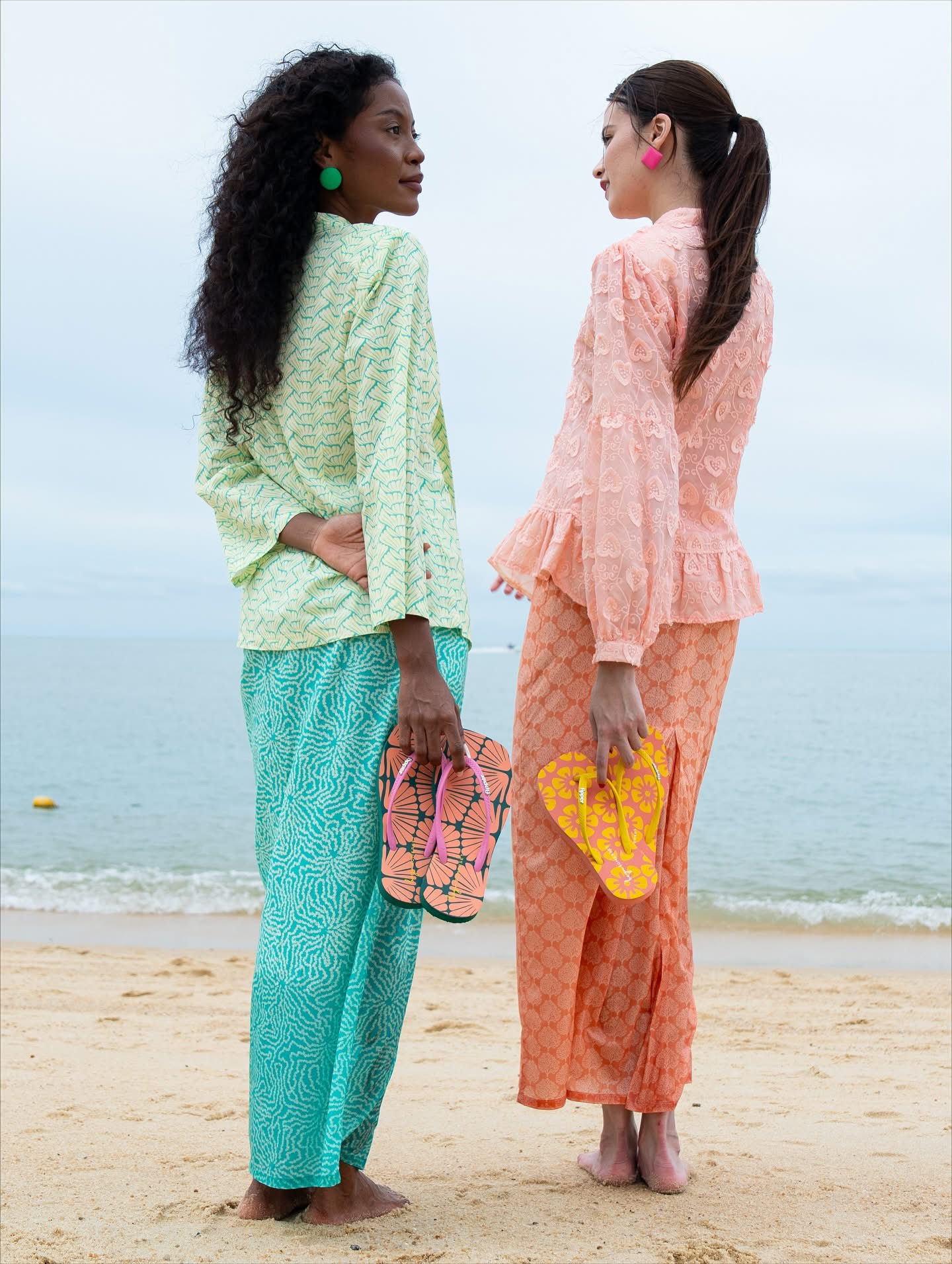
Bayu Somerset is a Malaysian fashion house specialising in modern modest wear — kebayas, baju kurung, and contemporary heritage pieces with a clean, modern execution.Many SKUs are sold as coordinated sets or styled across the catalogue, making multi-item baskets a meaningful AOV driver. Shoppers move between PDP and collection pages to build a full look before checkout, so browse momentum and cart accessibility are critical levers for revenue.
No items found.
Before
After
Before
After
Before
After

Heading 1

Heading 2

Heading 3

Heading 4

Heading 5
Heading 6

Lorem ipsum dolor sit amet, consectetur adipiscing elit, sed do eiusmod tempor incididunt ut labore et dolore magna aliqua. Ut enim ad minim veniam, quis nostrud exercitation ullamco laboris nisi ut aliquip ex ea commodo consequat. Duis aute irure dolor in reprehenderit in voluptate velit esse cillum dolore eu fugiat nulla pariatur.

Block quote

Ordered list

  1. test Item 1
  2. Item 2
  3. Item 3

Unordered list

  • Item A
  • Item B
  • Item C

Text link

Bold text

Emphasis

Superscript

Subscript

The Challenges

  1. Intrusive ATC confirmation broke browse momentum

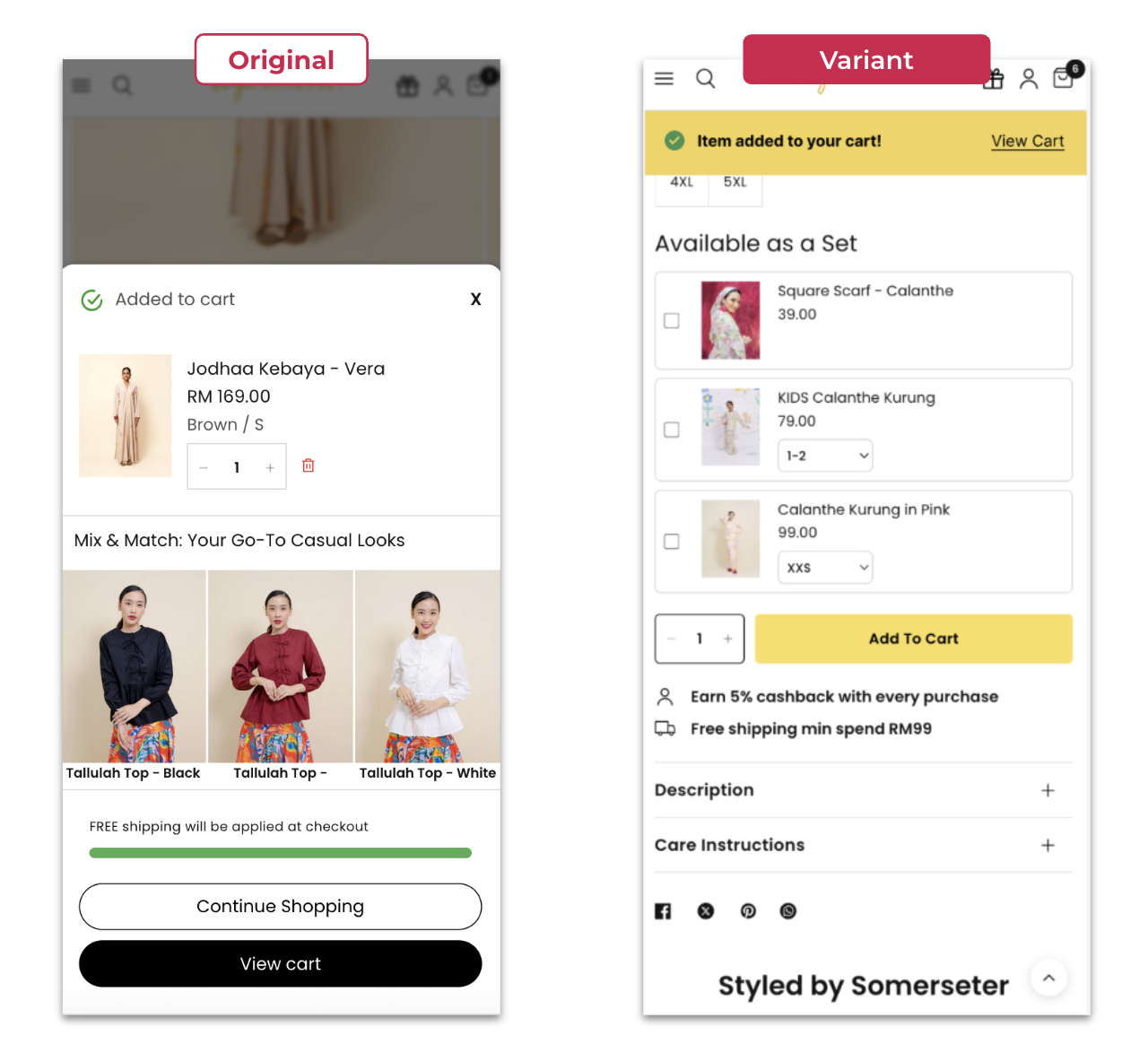
    Every add-to-cart triggered a bottom slider that required active dismissal — a costly interruption on a brand where multi-item baskets drive value.
  2. Search experience under-leveraged as a conversion-assist channel

    Popular terms shown in a carousel limited discoverability, suggested products lacked behavioural relevance, and placeholder copy gave no guidance.
  3. No urgency cues on PDPs for high-demand TikTok-driven products

    TikTok-driven kurung SKUs had no FOMO signals. Unclear whether urgency copy would lift CVR or feel hollow without stock counters or timers backing the claim.

Key Objectives

  1. Preserve browse momentum after add-to-cart to drive multi-item baskets and lift checkout completion
  2. Convert demand-led traffic at peak intent (TikTok-driven SKUs)
  3. Tighten the discovery → cart path on high-volume entry surfaces

The Solution

  1. Replace the intrusive ATC slider with a passive top notification

    Slim auto-dismissing dropdown preserves browse momentum without losing cart awareness. 
  2. Restructure search UI for navigation-led discovery

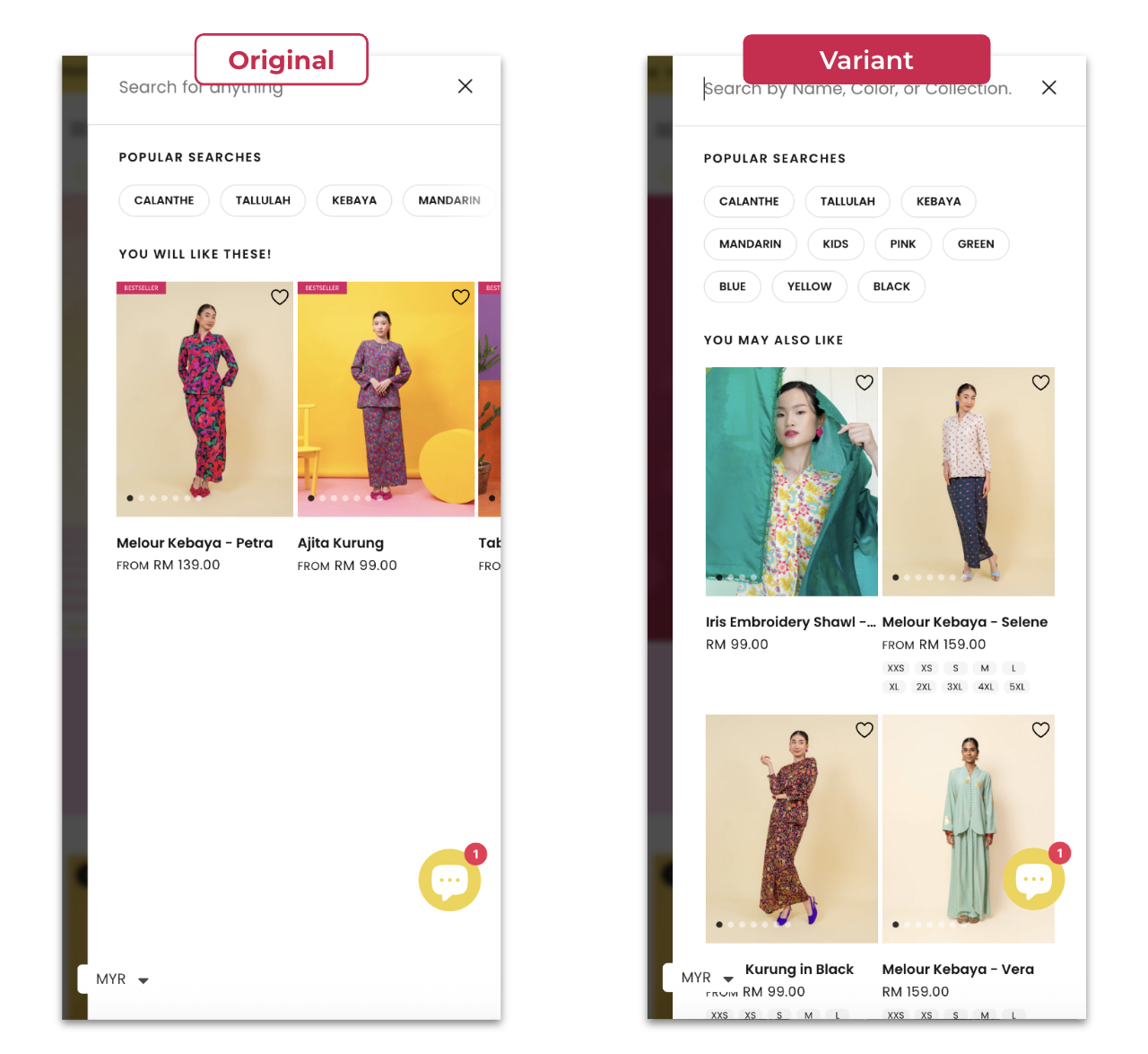
    Expand popular terms to row layout, refresh suggested-product logic, surface most-viewed collections, sharpen placeholder copy.
  3. Urgency labels test on PDPs for top TikTok-driven SKUs

    Testing Control vs 'Trending' vs 'Selling Fast' product tags on the TikTok bestselling kurung products. Measure CVR, revenue per session, and bounce.

Passive ATC Notification Replaces Intrusive Slider

Every ATC fired a bottom slider with dual CTAs that required active dismissal — pulling shoppers out of browse mode on a brand where multi-item baskets drive value. Replaced with a slim auto-dismissing top dropdown. Confirmation message + single 'View Cart' link only. Browse momentum preserved.

Results:
+11.6% Checkout Rate
+5.1% AOV
+RM2k Incremental Revenue 

No items found.
No items found.
No items found.

Search Bar Restructure — Partial Win, Clear Learning

Search was under-leveraged. Carousel layout buried popular terms, suggested products lacked behavioural relevance, and placeholder copy offered no guidance. Restructured the search UI: row-layout for popular terms (up to 10), behavioural product recs, new Most-Viewed Collections section, sharper placeholder copy.

Results:
+59% Search Clicks

No items found.

Results That Speak for Themselves

We focus on tangible outcomes—not just design for design’s sake. Here’s what our clients typically see after we launch or revamp their Shopify websites:
+11.6%
Checkout Rate
+5.1%
AOV
+RM2K
Incremental Revenue
Better user experience = better results across sales and marketing performance, including higher ROAS for ad campaigns.

The Challenges

  1. Intrusive ATC confirmation broke browse momentum

    Every add-to-cart triggered a bottom slider that required active dismissal — a costly interruption on a brand where multi-item baskets drive value.
  2. Search experience under-leveraged as a conversion-assist channel

    Popular terms shown in a carousel limited discoverability, suggested products lacked behavioural relevance, and placeholder copy gave no guidance.
  3. No urgency cues on PDPs for high-demand TikTok-driven products

    TikTok-driven kurung SKUs had no FOMO signals. Unclear whether urgency copy would lift CVR or feel hollow without stock counters or timers backing the claim.

Key Objectives

  1. Preserve browse momentum after add-to-cart to drive multi-item baskets and lift checkout completion
  2. Convert demand-led traffic at peak intent (TikTok-driven SKUs)
  3. Tighten the discovery → cart path on high-volume entry surfaces

The Solution

  1. Replace the intrusive ATC slider with a passive top notification

    Slim auto-dismissing dropdown preserves browse momentum without losing cart awareness. 
  2. Restructure search UI for navigation-led discovery

    Expand popular terms to row layout, refresh suggested-product logic, surface most-viewed collections, sharpen placeholder copy.
  3. Urgency labels test on PDPs for top TikTok-driven SKUs

    Testing Control vs 'Trending' vs 'Selling Fast' product tags on the TikTok bestselling kurung products. Measure CVR, revenue per session, and bounce.

Passive ATC Notification Replaces Intrusive Slider

Every ATC fired a bottom slider with dual CTAs that required active dismissal — pulling shoppers out of browse mode on a brand where multi-item baskets drive value. Replaced with a slim auto-dismissing top dropdown. Confirmation message + single 'View Cart' link only. Browse momentum preserved.

Results:
+11.6% Checkout Rate
+5.1% AOV
+RM2k Incremental Revenue 

No items found.

Interested in working with us?

Book a 30-minute discovery call with us and find you best quotation.

Book a Call

More of Our Works

Circle DNA Website Mockup for Mobile and Desktop

CircleDNA

Revamped website to boost conversions & refresh brand identity.
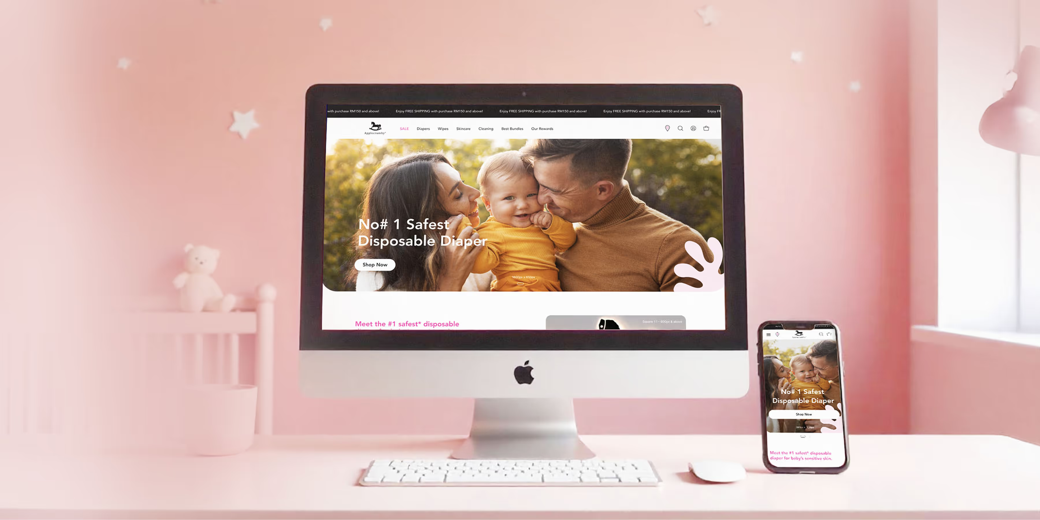
Applecrumby E-commerce Website Built Mockup for Mobile and Desktop

Applecrumby

Strengthened brand storytelling to boost customer conversions.
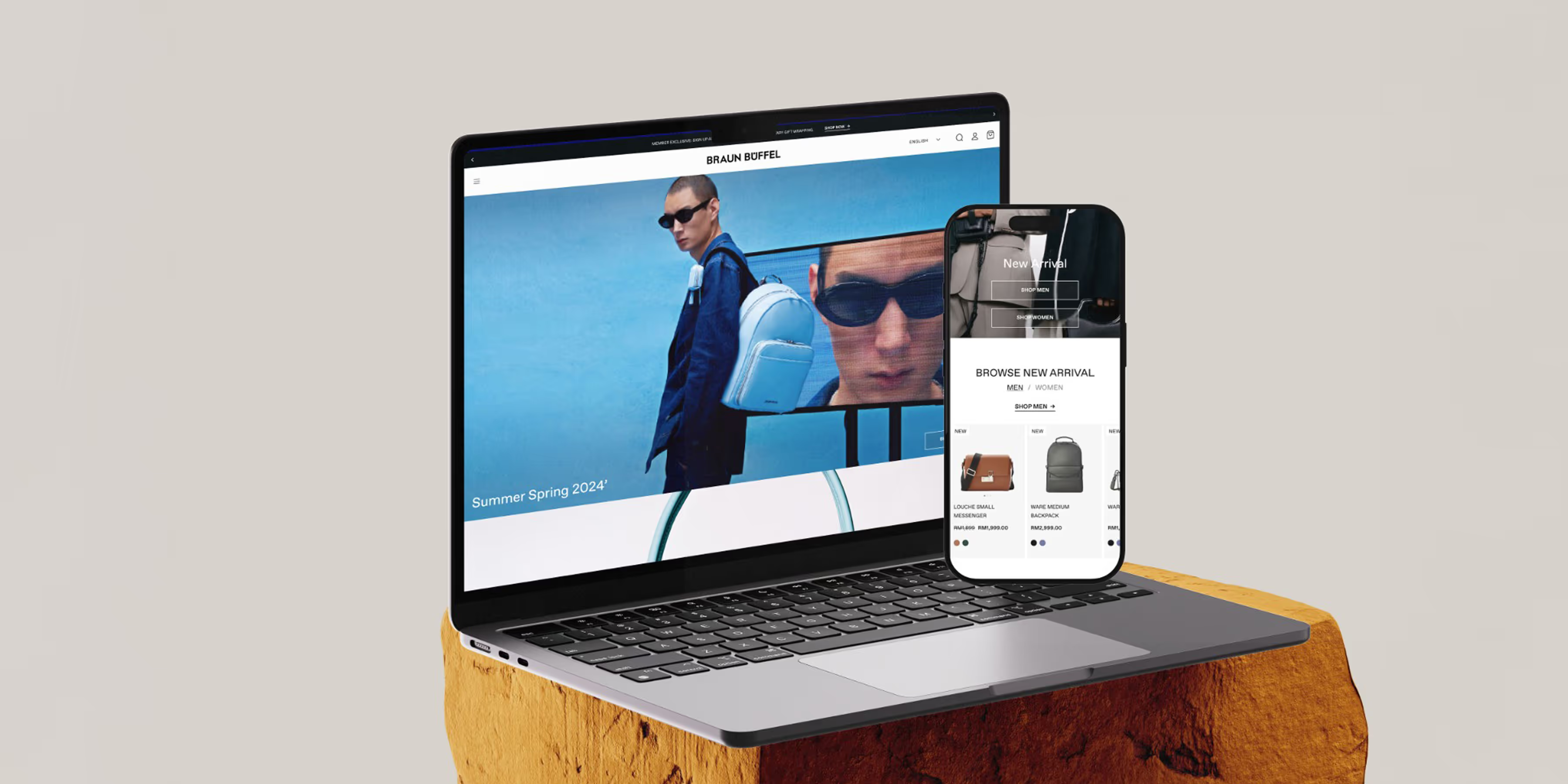
Braun Buffel Website Development Mockup for Mobile and Desktop

Braun Buffel

Strengthened brand and boosted conversions with strategic design.
Circle DNA Website Mockup for Mobile and Desktop

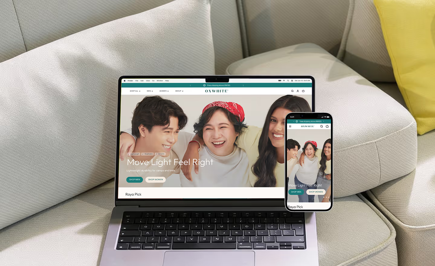
Oxwhite

Driving +25% AOV: Strategic UX and navigation for a minimalist lifestyle leader.
Circle DNA Website Mockup for Mobile and Desktop

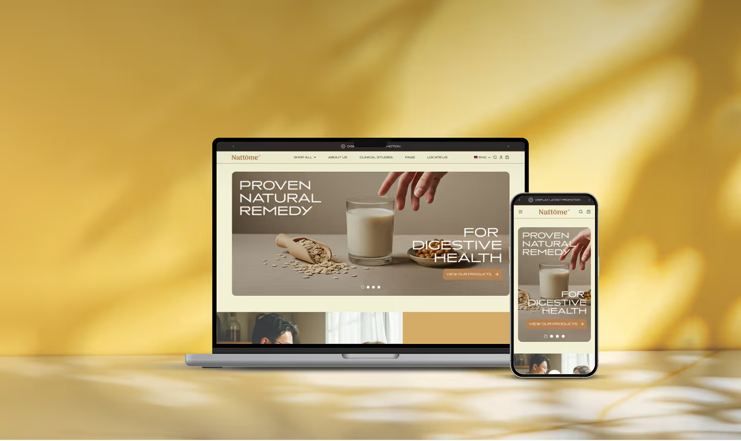
Nattome

Boosting Conversions by +40%: An education-first Shopify revamp for a natural health leader.
Circle DNA Website Mockup for Mobile and Desktop

Chuck's

Scaling Sales by +89%: Transforming the storefront and UX hierarchy of a bold beauty disruptor.

Check Out @conversiondaryl

Roasting and fixing e-commerce websites, offering valuable marketing insights from a professional's perspective.

Bayu Somerset

Bayu Somerset is a Malaysian fashion house specialising in modern modest wear — kebayas, baju kurung, and contemporary heritage pieces with a clean, modern execution.Many SKUs are sold as coordinated sets or styled across the catalogue, making multi-item baskets a meaningful AOV driver. Shoppers move between PDP and collection pages to build a full look before checkout, so browse momentum and cart accessibility are critical levers for revenue.

Get a Free 30-Minute Consultation

Thank you! Your submission has been received!
Oops! Something went wrong while submitting the form.